Op Art Modernist case study, Burton Kramer
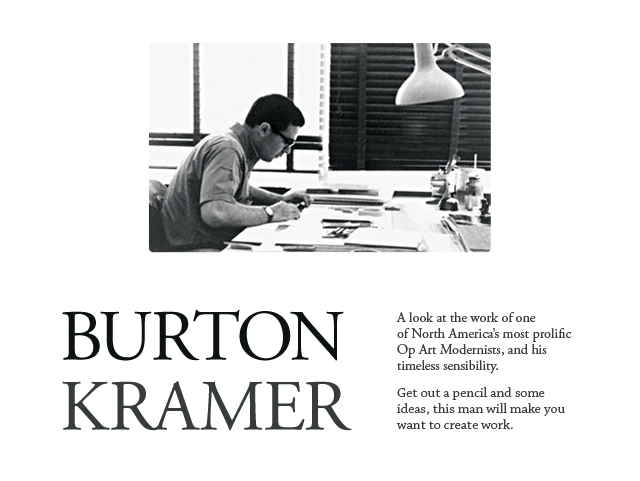
Most well known for his iconic, geometric, and order-based mark used for the Canadian Broadcasting Corporation, Burton Kramers’ work spans just over five decades, two continents, and too many design trends to count. Despite such a large breadth of time designing, Mr. Kramer has remained a seminal figure in Optical Art, modernist theory, and logic-based reasoning applied to design solutions. And then there is the beauty of his work, which rips right through the decades, and into relevance in 2011. Here is a small smattering of his works.
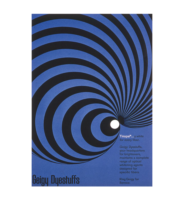
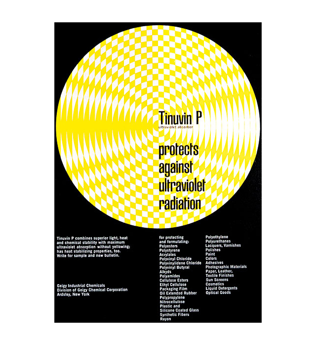
These two pieces were created for the Geigy Corporation in 1960.
The black, white, and blue poster at top is worth mentioning as a concept, style, and technical illustration of a product. Kramer is showing a type of brightening agent for fibers abstractly represented by curvilinear radiating lines. Similarly, the black, white, and yellow piece below it, another abstracted yet technical concept is presented through geometry and optical confusion.
To qualify as Op Art one generally works with color vibration or black & white illusions between understanding and seeing. Kramer isn’t trying to trick our eyes here, but since the pieces above were created 4 years before the term “Op Art” was coined by Time magazine, I’ve included them in the idea of what Op Art expresses. In my opinion the display of abstract shape specifically to optically express a concept or mood should be included in Op Art. Largely because even if there is no visual movement, there is still a deliberate illusion between picture and plane.
Burton Kramer wasn’t the first to try and confuse picture and plane, but he was on the leading edge of applying it to graphic design and the modermist movement. A skilled draftsman, here are his comments on his process when the two pieces above were likely created, pulled from the book Burton Kramer Identities:
“I needed only a drawing board, a t-square, some triangles, pencils, a sharpener, a desk lamp and a chair. Now one needs a computer, the largest monitor possible, a scanner, a printer, software, a copier, a fax machine, etc, and it all costs.
Clients believe everything can be done overnight, and want to see “options.” It’s a bit like baking three or a half dozen excellent cakes, choosing one and throwing the rest in the waste container.”
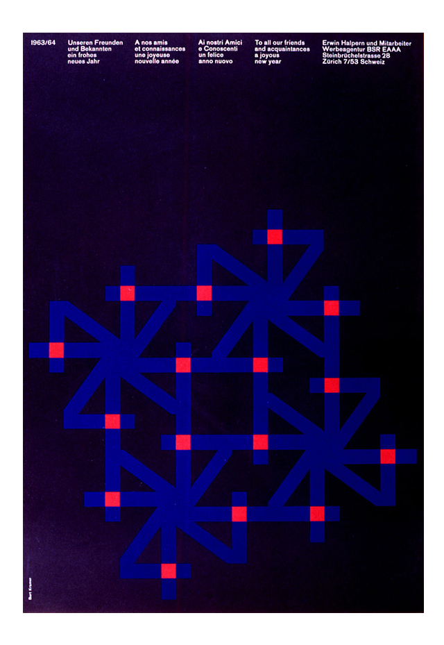
This New Year Greeting card was created in 1963 while Kramer was working in Zurich at Erwin Halpern Advertising. The orbiting Z forming snowflakes or fireworks set on a black field, perhaps the night sky of Zurich, completes an image that is trend-free in the sense that it is still fresh, still hot, and will always be dynamic. Kramer then chose to merge this linear expression with the Swiss/International Style of displaying information. There are many reasons these things last. Similarly principled works can be found by checking out Josef Muller-Brockmann, Armin Hoffmann, and Alvin Lustig.
*Edit: I’ve been informed by Mr. Kramer that the “Halpern new year greeting is based on the number 4… for 1964, not the letter Z for Zurich…but that’s OK.” – Thanks for the correction!

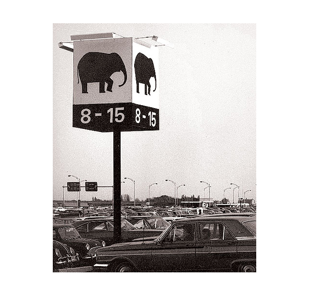
In 1967 Montreal hosted the International and Universal Exposition, and was later heralded as the most successful World Expo of the 20th Century. This meant the task of way-finding for up to 1/2 million human visitors per day was a serious and important undertaking. Kramer devised a series of pictograms for two massive parking lots, and continued his use of repeated imagery throughout the exhibition area. if I were born 24 years earlier, I’d probably find myself driving to the animal of my preference and parking directly beneath it to marvel at these awesome icons.
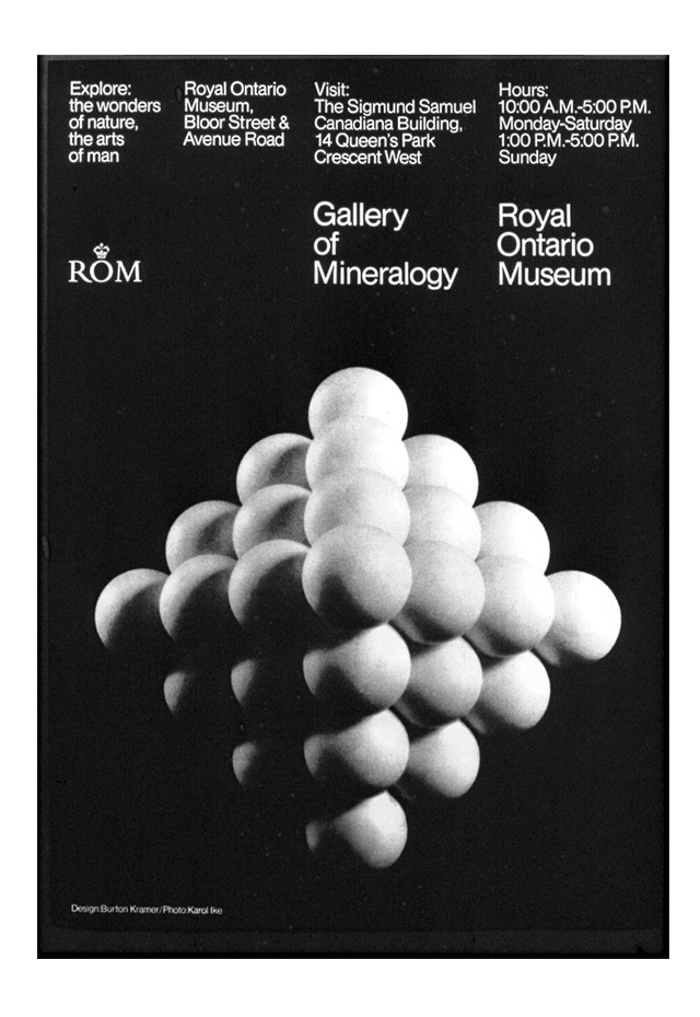
Later, in 1967, Kramer decides to utilize realism coupled with the International Style, in a poster for the Gallery of Mineralogy in Toronto. I can imagine some amazing rectilinear shapes as a solution for this one as well, I find it interesting that he opts to use realism and circles for this piece. Also I’d love to know if he worked with the photographer to build the model or if this was scientific scale model of atomic structure. The gradation of shade and alignment of the form are optically mesmerizing.
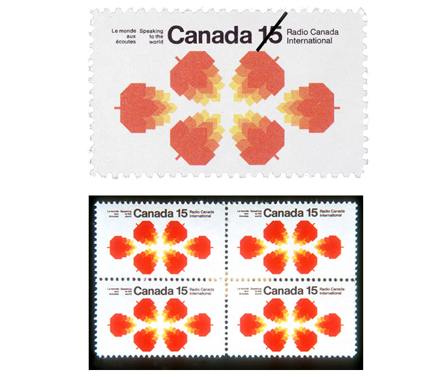
In 1970 Kramer designed these stamps for Radio Canada International, which may have been a preview of coming attractions, as 4 years later Kramer was commissioned to design the identity which he became most famous for, the logo for the Canadian Broadcasting Corporation, another radio company.
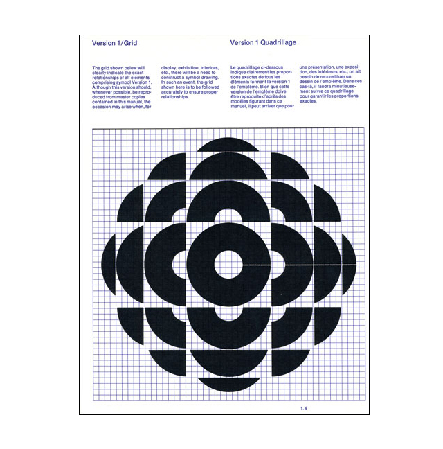
The Canadian Broadcasting Corporation (CBC) asked Kramer to redesign their identity in 1974. This has become his most famous identity and legacy as the company retains a simplified version of the identity today, and maintains a very high profile in Canada, similar to CNN in this country.
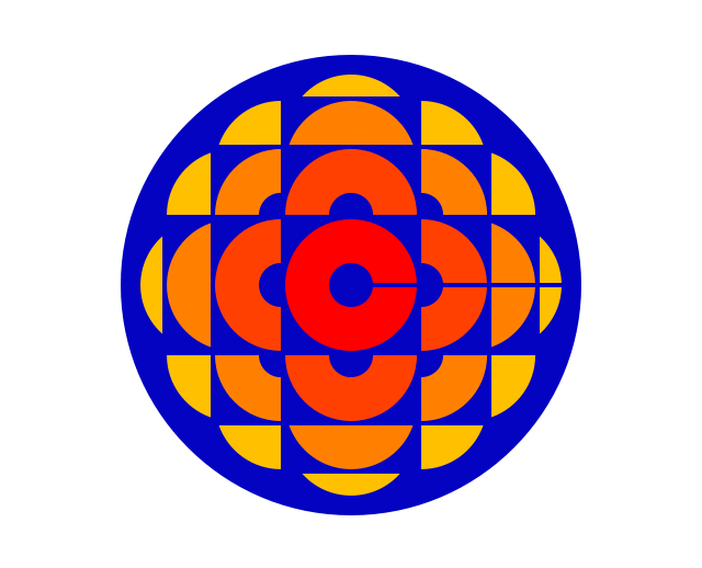

The original red, orange, yellow, and blue mark was unveiled in 1974 and served until 1986, when the single color gem logo took over, until 1992. The simplified red version is still in use today
(see it in action).
In addition to this icon, Kramer consistently created marks that are difficult to determine their decade of origin. This is consistency and talent applied.
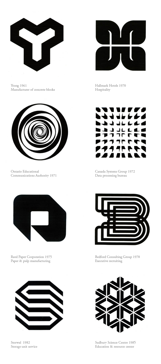
Mr. Kramer spent years working in Europe, Canada, and the United States. When asked about the major differences in working in these locations, he answered as follows:
“In North America, with its generally anti-intellectual, anti-art, pro-sport and pro-gun culture, design was viewed as a ‘frill.’ It was never part of the mainstream culture, if we must refer to pop culture as culture.
In Europe (Switzerland specifically), if I told someone I was a Graphic Designer, they knew immediately that I was a working professional, and that what I did was important.”
I love this post…Good work Fortport
A great review of Burton Kramer’s exciting work! Thank you! It is always a thrill to see “the real deal”, excellent work that is timeless. His current paintings are just as rigorous and complex with exquisite colour combinations that are delicious to ponder.