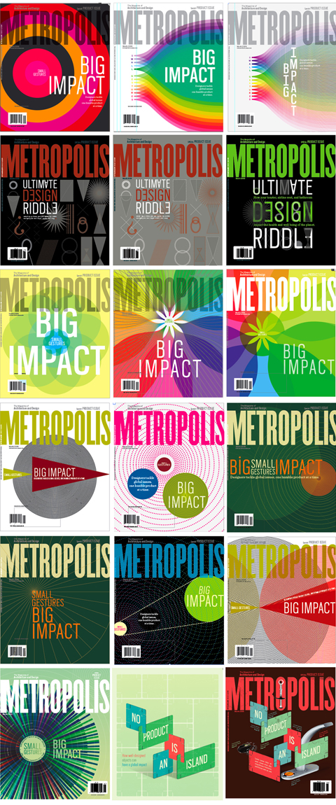
Metropolis cover
Lis Charman over at Portland State University teamed up with her husband Brad Trost to design the latest cover of Metropolis magazine.
This is so so excellent, not only the final solution but all of the iterations. This is called prolific! What an example to set for all her students in the design program.


While working on this Brad and Lis went through these gorgeous versions:

From Brad & Lis:
We were asked to come up with four different ideas. We gathered inspiration and researched systems thinking and sustainable product design. And, of course, we sketched and talked (and sketched and sketched).
There are more iterations, process, and commentary over at Command Save.
Thanks for sharing these with us, it is such a treat to see the process as a whole, and regard such excellence. PSU GD 4 EVA!
Thanks guys! By the way, you two are the best – love the blog! We are lucky to know you both.
Aw so sweet you are just a bundle of love! Jelly and I gushed over your mag today – looks so good in print!
great solution guys.
Love the ripple effect.
I once did a series of chaos/directed arrows,
inspired by Leo Lionni’s Swimmy. Strength in numbers.
Best,
T