Starbucks Reserve flagship Portland store
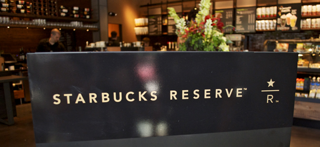
The coffee snob that lives a hearty life inside me generally says “Starbucks” as much as Harry says “Voldemort.” But I am attracted to the only Starbucks in the world outside Seattle that is offering food, wine, and a different atmosphere from the Starbucks I fled years ago.
This company has taken its lashes from this town. In SE Portland rocks were thrown through a shop’s windows, and the neighborhood rose such a stink that the store closed up. Today, I walked in what used to be the Pearl District’s Adidas store, and was surprised to see what is happening. Basically Portland is being tested. Do we want this in our lives? Are there enough people indifferent to the flavor, meaning, and origin of their hot bean juice?
If the honor is in the source, is it enough that the materials in the actual shop are sourced from Oregon, but not the product?
Well that’s not totally fair. Coffee isn’t sourced from Oregon, or the Pacific Northwest. OK perhaps it’s fair to say the Corporation isn’t local. Well it’s regional. Ok this is a losing battle, because the beer in Starbucks Reserve is all local, and most of the wine selection is too. What we’re bitching about as a group is that it’s Starbucks. Can I realize that for a second and just peek inside the new store? Probably.
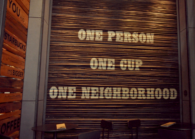
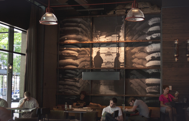
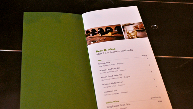
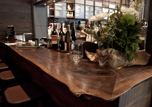
2pm meeting? Why be ordinary and just get coffee? The coffee sipper in the corner could actually be an alcoholic, since drinking in a coffee bar feels about as comfortable as dressing in drag. They were smart enough to stash the bar off to the side with dim lights however, so it does feel like a semi-private affair. And on a salvaged Oregon Walnut bar!
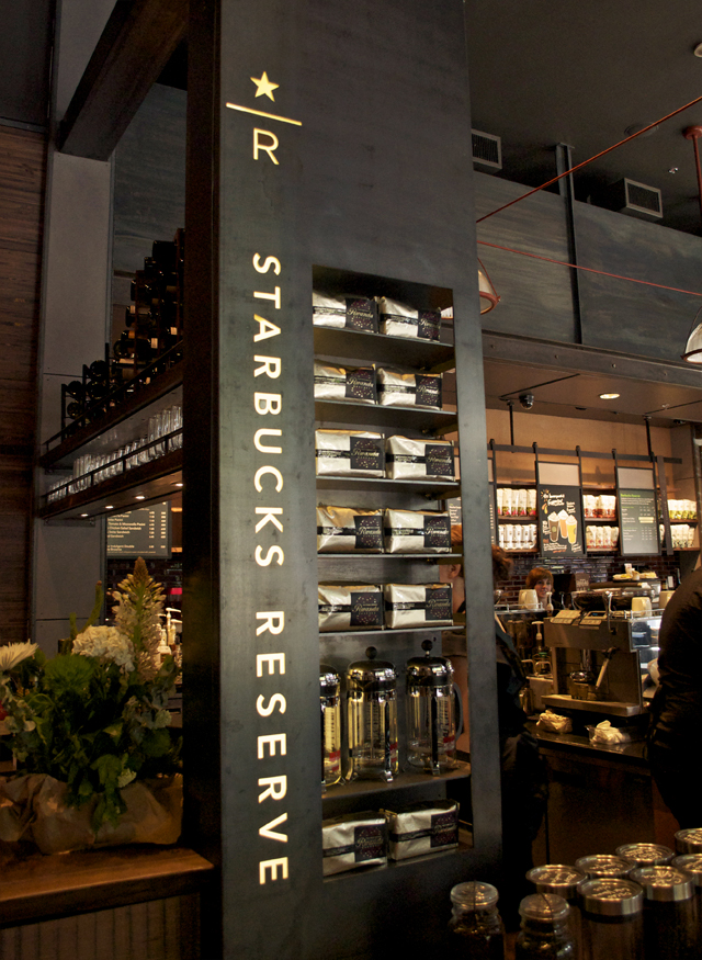
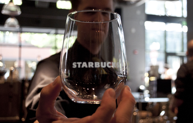
I never thought I’d see this logo on a wine glass. And you nearly can’t because I couldn’t get my focus on it for the life of me, sorry folks. I would feel so weird sipping from this, I will admit. It’s like if a shot glass had the word “crochet” on it, just hard to fit the two separate ideas in my feeble mind simultaneously.
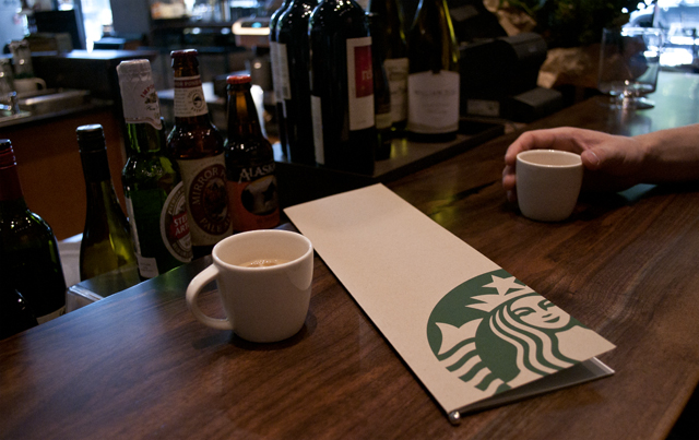
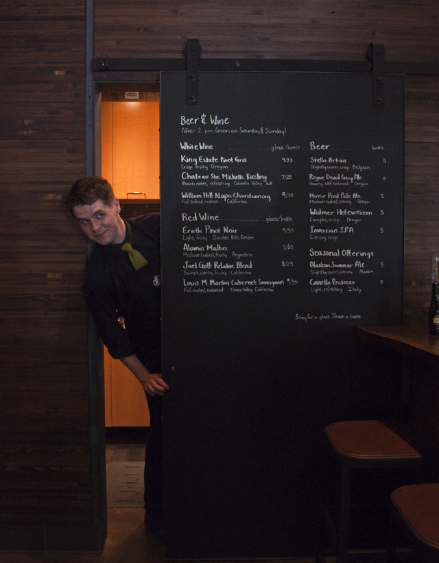
In the end the service was incredible. The company has likely chosen its top baristas to represent this location. Way nicer than anything I’ve experienced at Stumptown. In fact, I expect shitty service at Stumptown, just like you expect bitchy service in central France. Is there a nexus where great coffee exists in this town without the ‘tude?
If I can’t get the coffee I want at Starbucks, I wonder if I’ll get the food, beer, or wine there. The black aprons of the staff, rather than the green, are doing their best to woo the pedestrian of the Pearl into their air conditioned, gently lit timbered, vaulted, and styled pad.
One reason to go for sure, Adam House, pictured above. His energy is better than the coffee. You won’t leave without a wink and a smile.
HMCS Whitehorse + Dunderdon

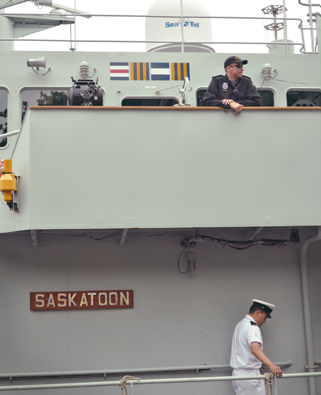
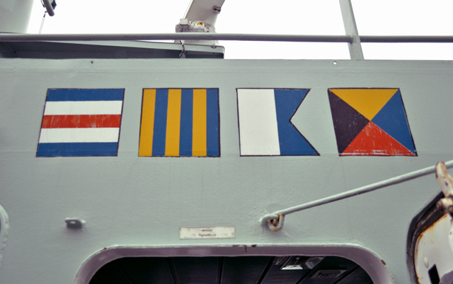
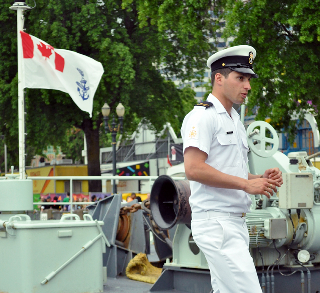
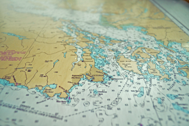
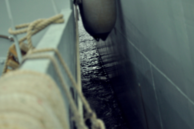
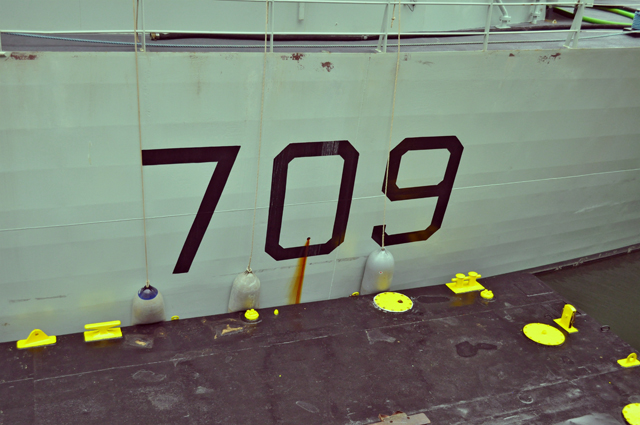
June is parade month in Portland, which includes fleet week as part of the Rose Festival lineup. Our friendly neighbors to the North usually compliment our banks with a ship or two and this year I toured both the Saskatoon and Whitehorse which are twin Kingston class coastal naval defense vessels. Canada has 12 of these 55 meter steel beauties, 6 on each coast. They’re not heavily armed, but more used for surveillance. The Whitehorse, where I spent most of my time, was just built in 1998. Young guns!
The Saskatoon and the Whitehorse were tied together for folks to tour, lead by eager officers with lots of patience for kids, rain, and photographs. Although they were less patient when I tried to stow myself in a storage compartment. Take me home with you already I deserve honorary citizenship by now.
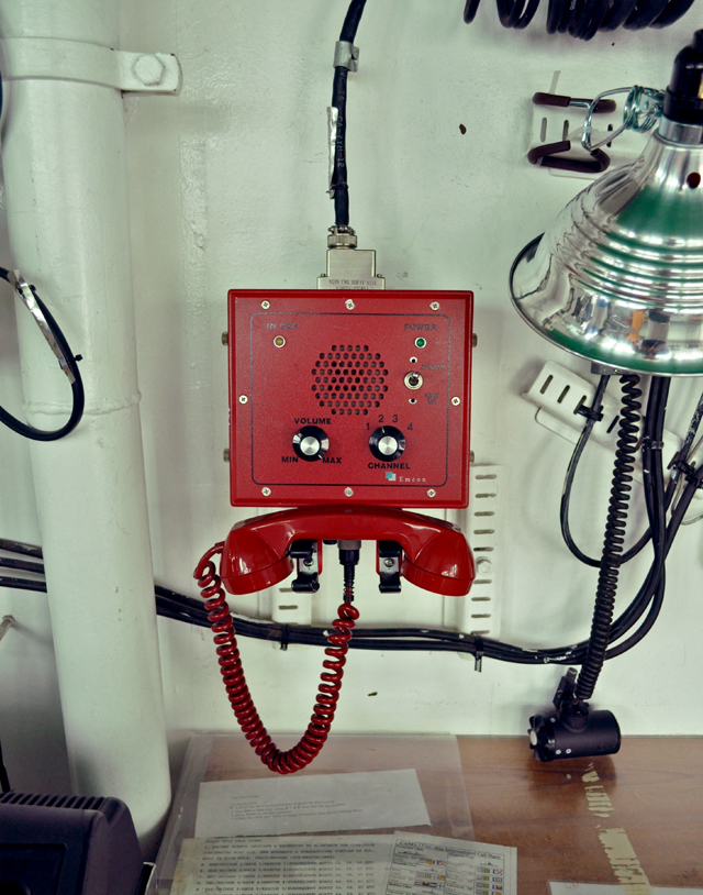
Does this not look like the phone used to launch nukes? I just saw one of these in Portland Modern and it was $600! I guess buying a red phone means something to someone. It would just be nice to have a nice bright red rotary phone, you know? The kind that might sit in the Situation Room. Not Wolf Blitzers situation room, the real one.
Last years post on the HMCS Vancouver means that I have now been on 3 of Canada’s naval vessels. I’m not sure this means anything to anyone, except for a budding Canadian.
Also, has anyone been following the aftermath of the riots in Vancouver? This is how a city responds when they have pride for their home: Vancouver Heals. Vanlover!
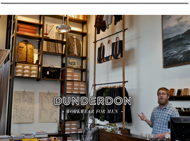
Has anyone been into Dunderdon yet? The Swedish workwear company has a fresh new store near Burnside at SW 13th, just up from Powell’s. I realized why I loved the store right when I walked in, it was designed by the raw talent at OMFG Co. Great work guys, also if you have any of that rope laying around I’ll take a roll.
This store smells of freshly chopped wood, leather, and beards. All the right stuff.
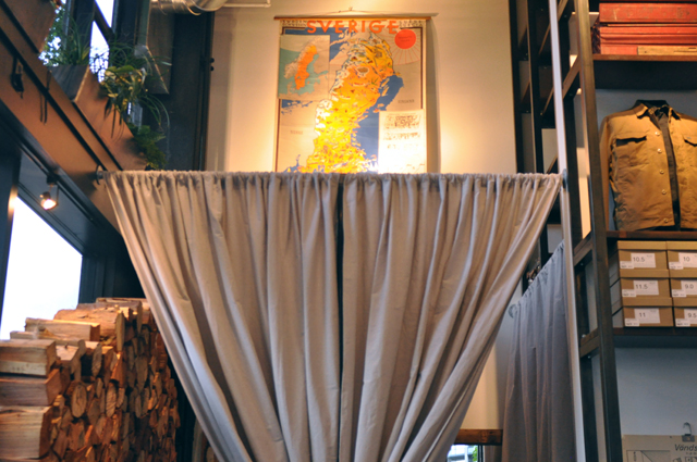
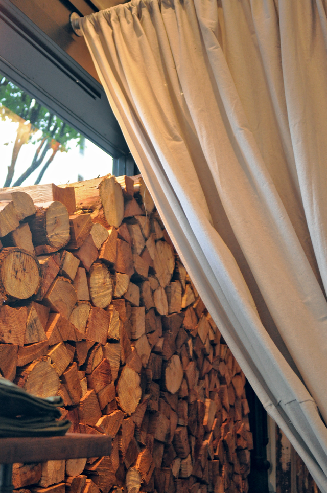
What is one to do when your dressing room is a street-level window? Stack a chord of wood in it, obviously. This makes the store smell like a permanent Vermont campsite.
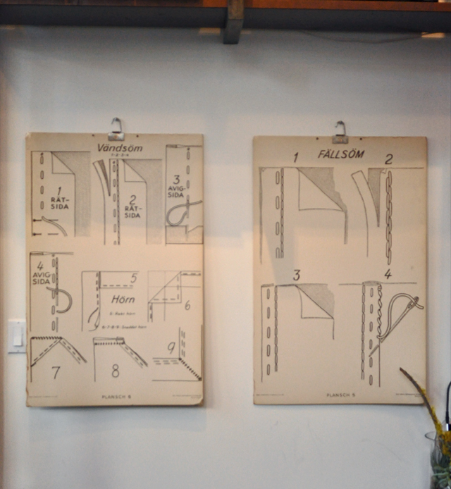
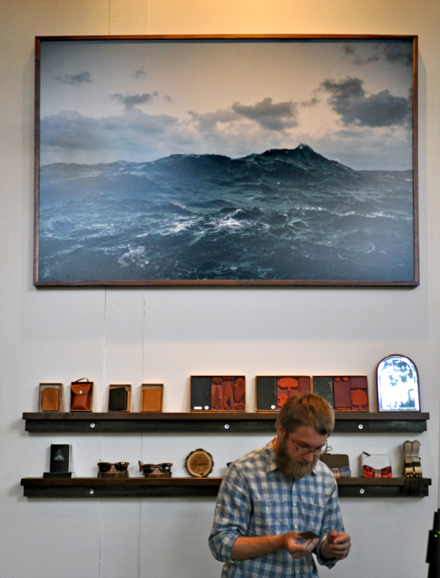
Lots of excellent merchandise in the store, check their Spring/Summer 2011 catalogue here. One of the more imposing features that strikes you when you walk in, the piece above the register. Just look at that composition and color! I was staring inappropriately and was informed the piece was by Corey Arnold. Local, AND genius. Well done, Dunderdon.
“The Tree of Life” review
“Tell us a story from before we can remember.”
Terrence Malick as a director polarizes his viewers. There are hordes who would rather clean cat litter all night over sitting in a theater under the weight of one of his films. For the record I adore this mans work, and relish in the opportunity to enjoy his films on the big screen. It is a rare event, after all, since his feature-length debut in 1973 with Badlands, Malick has only directed 5 films. Just about once a decade he comes out of hiding to spend two to three years crafting some of the most important cinema of the century.
Yesterday I consumed Malick’s latest work currently in select theaters (FOX Tower, in Portland) The Tree of Life.
It’s difficult to know how to verbalize the grand scale of this work, since it literally spans a 14 billion year timeline. What one can deduce from the trailer, I will only reveal here.

There is a family, with three boys, a father (Brad Pitt) and a mother (Jessica Chastain), a sixth character (the Universe) and a seventh that brings the script into vivid form (the viewer, you). Integrally, these seven trapse into and out of conceivable lapses of time. A theme, the only theme we know really, of birth and death, form and nothingness, and the struggle between nature and grace.
Basically Malick presents to the viewer a story that is manageable enough to follow, and vague enough for you to finish. Intertwined is the planet, its history, and stories within that history that underscore the theme, which is a complete departure from Hollywood box office gold. Such a departure, in fact, that in-theater one can sense other viewers struggling in their seats, muttered derogatory comments, and fidgeting hands.
There are direct references to Malick’s own upbringing, many events from the film happened to members of his own family, and the setting, 1950’s Texas, was the setting for his own childhood. Often exposed to Disney and Spielberg storylines where one or both of the parents are all too absent, Malick presents ever-present parents in their most honest form. The all-seeing-eye of parenthood reveals flaws, discrepancies, turmoil, and the full bewilderment of a child coming to terms with adulthood and maturity. A complete parallel to the awareness of humanity and how we came to be this way: sentient. And it’s that sentience that is so beguiling.
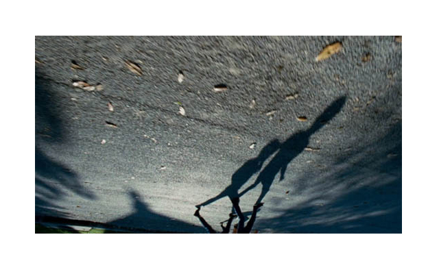
The same hopes, fears, desires, and loves that we all feel are encapsulated in the macrocosm that is presented. In fact the macrocosm and universe are so integral, Malick spends a full 18 minutes reveling in its breathtaking grandeur. Planets, stars, nebulae, the boiling surface of the sun, also spending time in the microcosms inside of us at our cellular level. Our hearts, our cells, our veins, and the glimpse of a baby in its womb. These scenes are some of the most incredible cinematography I have ever experienced. Malick compliments this macro scale when he films his characters effortlessly in an incredibly tight, close-up fashion, as they are at the height of their emotion.
As in some of his earlier work like The New World, Malick uses voice-over throughout, in a whispered prayer from each of the main characters. The New World was the first time I’d experienced this sort of narrative, when Pocahontas has her son in England and she realizes where here spirit lives, she utters “Mother, now I know where you live.” It’s powerful, because the viewer is allowed to enter the inner most thoughts of the character. This, coupled with all the right imagery, the most elusive, nuanced, poignant score and a story bursting with human themes is why I’m still dizzy from this film.
Go out and see it. Take your love, take your friend, take a stranger. There are no explosions, no revelations, and no conclusions. Like the best stories, this film will unfold slowly in your mind only after you leave the theater.
Guest post – Honest Design
I’d like to introduce a friend of the FORT, one Ryan Bush – who has been instrumental in previous posts, playing an obscured role in the shadows of this blog. No more, we say! Ryan wrote a piece on what he sees happening to our craft, and I’ve a response of mine below if you care to hear it. If you’ve got beef with it, love for it, or are just here for the 1/2 priced cocktails, be sure to voice your fabulous opinion in the comments. Enjoy Honest Design.
Honest Design
I am a student, and a designer. As I have grown and learned more about design, I begin to take in and silently critique the things I encounter in my daily life.
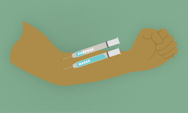
I have become immune to many of the alluring gimmicks that businesses create to sell their products, and there are still some that I will be entranced by no matter how wrong I am for it. This is the plight of most designers today: creating the desire to buy, invest, contribute to x-business. Dine here because we have the genuine family experience. Drink this because it’s fresh and high quality. It’s an endless cycle of business creating fodder for products/services and designers creating an ad/identity that glosses over the bad things and focuses only on the “good.” This cycle continues because of the focus of monitary compensation. Business creates shitty products for less money, designers make the product look nice to get payed.
Needless to say, the power of design & the designer is very real. Take a look at the recent ad campaign for the Portland Timbers. It was a year ago that I mistook the Timbers for being our hockey team because I literally knew nothing about them. Since dozens of billboards have popped up all over the city, it has become very clear what kind of team the Timbers are, and I haven’t seen this many locals proud to wear a Timbers jersey… ever. There is now a sense of a Timbers community all because of the awesome ad campaign created by Jelly Helm Studio.
This kind of control over the subliminal psyche of a number of individuals is a scary thought, and I am not the first to say that this manipulation has been abused, and for a very long time. We have all become helpless to the ads of so many different products because some resonate so well with us that we feel that our lives would be better with said product (good design in action), but what happens when we create honest design?
What if the motivations behind all of our design work, all of the advertisements, all the businesses were not focused on increasing profits or selling more units, but was actually focused on the greater good of the individual and the community?
I have had many thoughts on the subject of “honest design” and as I continue to question this topic further, I have come to realize that for something like this to work, it would take a radical shift in the way that business is approached as a whole. Seeing as how design originated as a means of communicating the intentions of a business to the consumer, it is natural that for something like honest design to be successful, then the structure and intentions of business must be changed as well. I don’t mean to suggest that there is no honest design/business happening at the moment, but I think we all know that the majority of business that is out there is comprised of corporate entities that have few motivations in mind: make more money, make more product, make it cheaper, sell it for more.
If the intentions of our businesses are set in this way, then the designer is forced to create an image/identity for a company that is false, all for the sake of luring new customers to buy their products. Why is it though that we have to create these identities in the first place? Is it really too much to ask that the businesses we design for actually embody the grace and honesty that our marks and identities suggest? It feels like a shift is occurring in business all over the nation, which reflects in the design work that is supporting said business.
People are asking more from companies, more transparency, more honesty, better products for reasonable pricing, and as I see it, this is the way it should be.
As a designer, it is my responsibility to reflect the ideologies and intentions of the business that hires me to do so, but if that entails creating work that will make false suggestions on that companies’ behalf, there is a conflict in moral fiber there that is too hard for me to handle. As a student, and a developing designer, I am well aware of the fact that I am ignorant to the complexities of this situation. I have the safety net of student loans, teacher & peer input on my work. I am not forced to take whatever job comes my way because I don’t have a mortgage to pay. With that in mind, does that make me wrong for assuming that things need to change? The way I see it, yes, there is a lot of shitty business practice being done here, and yes those businesses pay high wages for designers to make them look nice, but what is the real gain? If a corporation invests its money overseas to create a product for cheaper, only to sell that product at a ridiculous profit margin back to us, is it really worth it for us to be representing them in an honest light? Business like this has been around for far too long, and designers have been strung along to chase the paycheck that comes from such profitable businesses.
What if there was a future where honest business was easily represented in honest design?
Can you imagine a time where good business was the norm? Where you get what you pay for? Where a company creates good products for the people because they appreciate the time ittakes to create something good, and they take pride in their work? I can. I do see it, but at this point it is only a whisper among the screams of big business, but I think there is a change in store.
I am well aware that this kind of conversation scares people, or makes them upset. It makes me look ignorant, and that may be, but there is within us all a tinge of longing for a future like this. I believe that this is the inevitable future of business and ultimately design. If we keep asking questions like this, asking more of ourselves and others, it’s bound to shape the outcome of our efforts in some way, isn’t it?
Response:
Transparency: This would be Aaron and I’m less than 24 hours removed from finishing the book Ishmael. Moving forward realize I’m more sensitive to this topic than normal.
It’s hard for me to embrace phrases like good business and honest design at first because they are so subjective. It seems fraught with turmoil to argue about ‘good’ business practices, because it then makes the arguer a policer of whatever ‘good’ business is. That said, I do struggle with this topic myself. If I wouldn’t buy Exxon’s products, why would I design them? I’m not sure how to reconcile this as a young designer who is facing student loan repayment, increasing rents, and the realization that financial stability is all it’s cracked up to be. Exxon is an easy corp. to use, because it’s so polarizing and obvious. So, I think my response is this: It’s up to me.
My gut will tell me if a client is right or wrong. And if I do work for Exxon it’s not wrong. It’s just not going to be work that I’ll be proud of, or that is “honest” in any sense. It’ll likely be more aligned with propaganda-laced lies and heavy marketing techniques, rather than anything to do with deep story, value, or purpose. It is wishful thinking to hope all clients will be aligned with deep story, value, and purpose (Purpose & value beyond that of shareholder purpose & value)?
Perhaps not. But it is at this stage in MY career. Choosing ones clients seems to be a luxury for those at a different point in their careers than I am.
My younger years will likely need to be focused on the craft, creativity, joy and enrichment I get from practicing design, and this vexes me only in principle, because I know there is more.
Later, I know I will yearn for added nourishment, purpose, and value in my work. I’m getting there, it will be a lovely season, but it’s a few years out. Mr. Ryan Bush, your thoughts are candid and illuminating. If you find a bushel of these clients you speak of, send them my way. FORTPORT will certainly be up to the task. We’re lucky to have students asking questions and willing to voice them to a group of strangers. You must have elephant-thick skin. Applause.
Camille Seaman
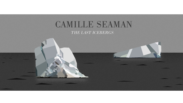
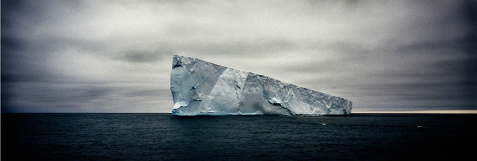
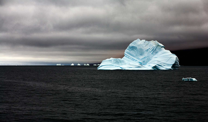
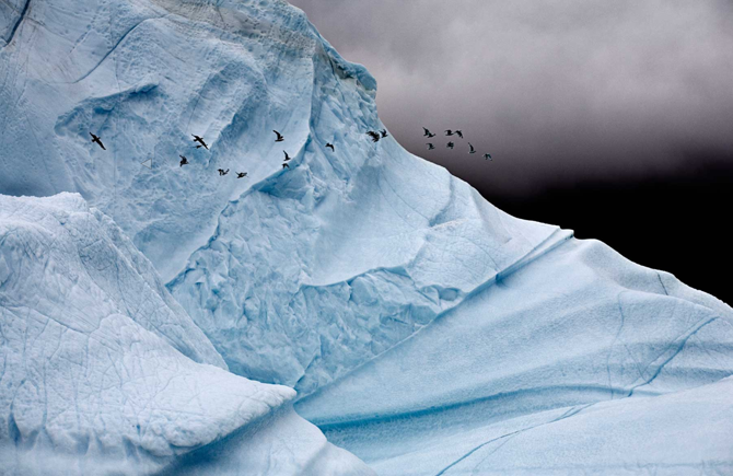
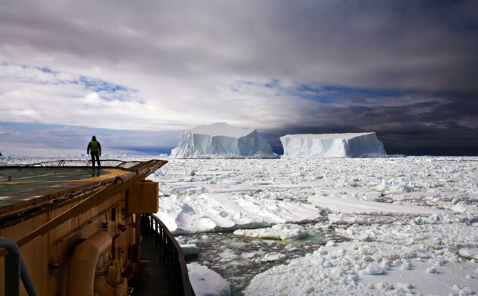
Is it fate or fortune that Camille’s last name is Seaman? It’s clear that her days are spent on the sea. Over the sea. Dreaming about the sea. But in particular a burden that the sea bears, that of icebergs. Her two galleries, The Last Icebergs, are as haunting as the title. Her commentary on some of the ideas behind the way she approaches an iceberg is revealing and moving. As if bergs weren’t moving enough. She treats them like ancestors, family members, and names them as such.
Some of the images are sad, all of them stunning. This is an image-heavy post, even for FORTPORT standards. If you find yourself craving more, which you might, head over to Camille Seaman’s site and check out all her galleries. Does this woman ever take bad photographs?
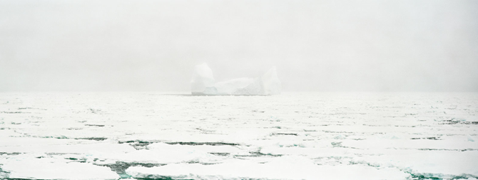
Camille is also a 2011 TED fellow and commented recently “The Last Iceberg is one piece of a larger project entitled “Melting Away” which documents the polar regions of our planet, their environments, life forms, history of human exploration and the communities that work and live there.”
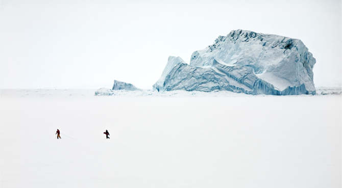
“The Last Iceberg chronicles just a handful of the many thousands of icebergs that are currently headed to their end. I approach the images of icebergs as portraits of individuals, much like family photos of my ancestors. I seek a moment in their life in which they convey their unique personality, some connection to our own experience and a glimpse of their soul which endures.”

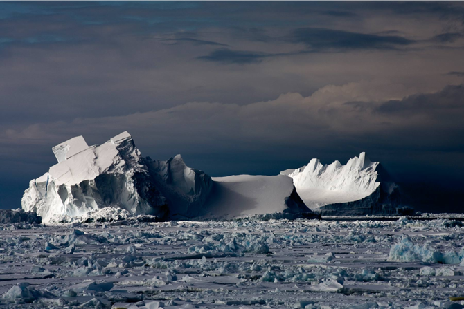
“Nick Cave once sang, “All things move toward their end.” Icebergs give the impression of doing just that, in their individual way much as humans do; they have been created of unique conditions and shaped by their environments to live a brief life in a manner solely their own. Some go the distance traveling for many years slowly being eroded by time and the elements; others get snagged on the rocks and are whittled away by persistent currents. Still others dramatically collapse in fits of passion and fury.”
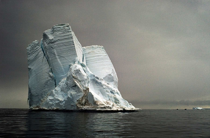
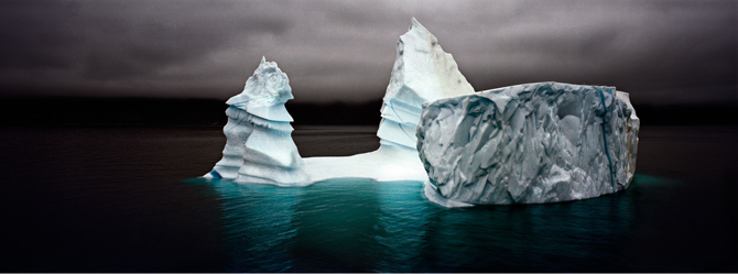


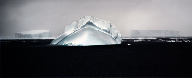

“Children of B15-A I, Ross Sea, Antarctica”
Her short caption assignes context to these wandering yet diminishing giants. Their source remains, while they sail north to their end on currents and winds. The story here is epic, considering the water contained in these ‘children’ can be as old as 150,000 years.
