The Spit Swap – Aaron Draplin & Invisible Creature
Design community oriented events usually satisfy our urges to see our kind in a condensed time & space, almost an excuse to see each other away from our screens, drink in hand, and in our socks, so-to-speak. There are very few occasions however where this is accompanied by the ability to see great work, hear magnetic speakers, and get stuffed with inspiration.
This phenomenon is called Designspeaks.
I have a special relationship with Designspeaks. It’s where I first saw Jelly Helm, Aaron Draplin, Eric Hillerns, and a cache of other makers from our industry in-person. To hear Jelly ask “where is your value”, hear Aaron’s tales of designing a logo in the back of a car for The Obama Admin., and all the other collected moments, is a privilege to reflect on. These experiences have molded my idea of what it is I do, and what I would like to do. The facilitators of this sort of experience deserve credit for creating culture, community, and a space for open thought. The salon, forum, and amphitheater for thinkers who make.
Those facilitators would be Eric Hillerns, Lloyd Winter, and Duane King.
And since these fine gentlemen have been brought up, you should know what is about to happen. A first for Designspeaks, an inter-city, condensed mind-stuffer.
Draplin has appropriately called this a Spit Swap.
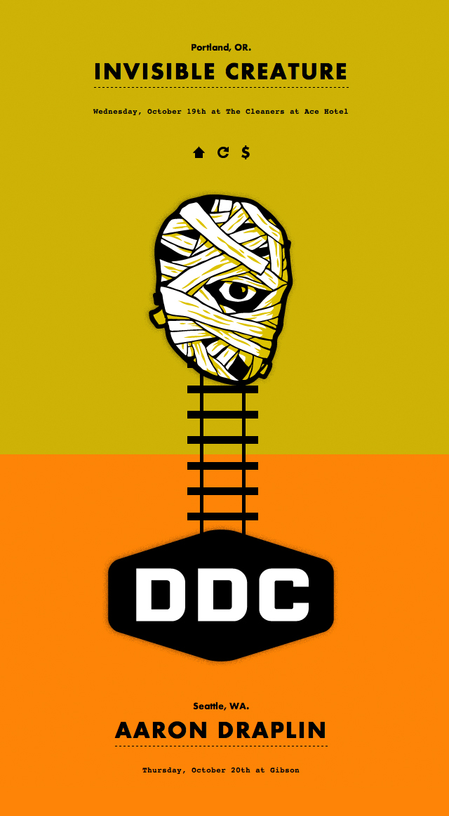
Invisible Creature from Seattle with come to Portland for a special Designspeaks event, and Aaron Draplin of Portland will go to Seattle for a special Designspeaks event, in a 48 hour period. Allowing you to see both. And you can take the train, and your mind may melt. Well, it may melt before the actual event when you see what Invisible Creature, Draplin, and Duane King have made for the event. If you’re not freaking out then step away from your machine.
Does this raise the bar for Designspeaks? Yes. Does this raise the bar for the internet? Fantastically.
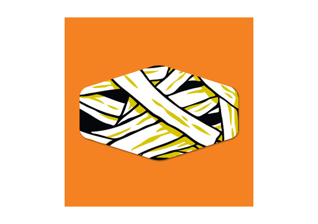
It started with a logo mashup combining Draplin Design Co. & Invisible Creature, which was featured on Invisible Creature’s site:
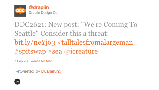
Which was caught by Draplin and featured in a post, and a tweet:
This activity inspired Duane King, which is a dangerous thing to do.
The result lead to the best teaser/info page I’ve ever seen in my life that you should visit right now, designed by Duane King, developed by Jessica Caldwell:
This image contains NO JUSTICE for actually visiting the site. Ride the rails people. Ride these beautiful, IC-DDC-DK rails.
$50 to get a double brain crunch in our region’s largest cities with a group of people who give a damn. That’s basically free. There are cobb salads in Nantucket that cost more than this.
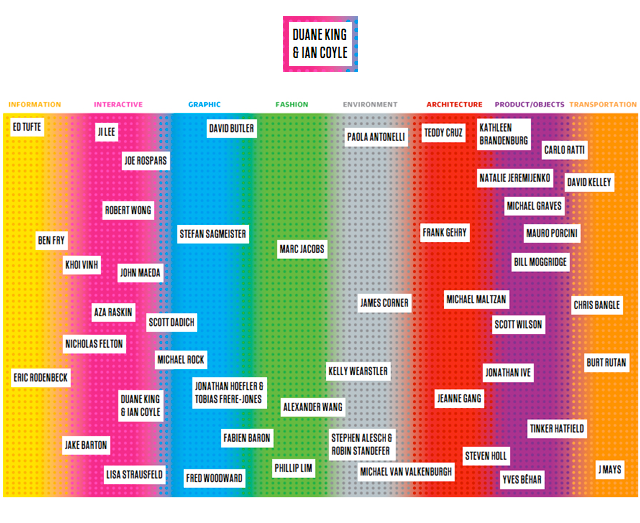
We’ve not done a post featuring Duane King before, most of you probably know who he is, and it is very much worth mentioning his recent accomplishment. Duane was called out by Fast Company as one of the 50 most influential designers in the America. With his wizarding partner Ian Coyle, the two have created some of the smartest work on the internet. Thinking for a Living, Nike Better World, it’s a long list, and now Spit Swap! Check out this chart from Fast Company:
I highly recommend one or both of these events. Eric Hillerns will thank you, and so will the grey matter in your skull. Soak it up, these people are hard American workers, are full of kindness, and have things to tell you. Listen.
Harney County, Oregon
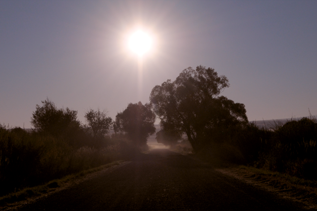
20 years ago I was taught how to birdwatch at Malheur National Wildlife Refuge in extreme S.E. Oregon by a lovely couple named Ralph & Sharon. We rounded up the usual suspects of a wetland riparian area in the high scrub country of the Great Basin. Canvasback ducks, White Faced Ibis, Cattle Egrets, White Pelicans, the whole crew. We had special moments spotting a family of Great Horned Owls high up on a rim rock cliff, shaded from the heat of mid day. I’m still hooked on birding, and this last weekend I returned from my double-decade break to the Refuge, and found a place I like to call the corner of Oregon.

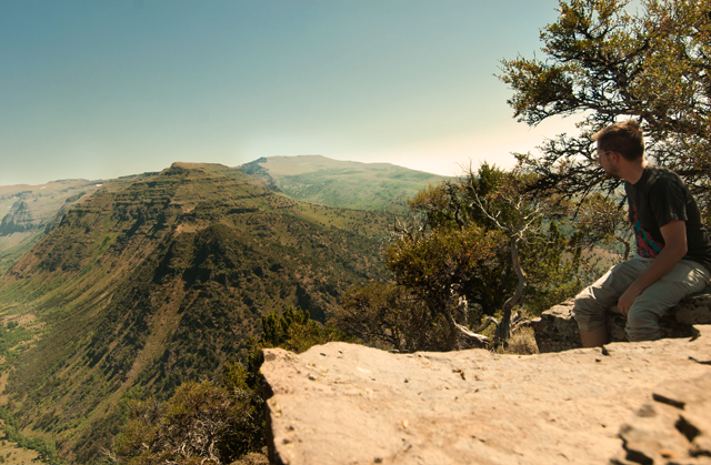
Near the Refuge is a geological wonder called Steens Mountain. It rises gently to 10,000 ft and then abruptly, where I am standing above, drops one mile to the Alvord Desert below. The East slope is so gradual in fact that you can drive (unpaved, 4×4 only) right up to the summit & East rim! This particular day there were thousands of Cabbage Moths that had just migrated and begun to mate, you can see one in the lower right hand corner of the photo above. Standing here in the early morning is a moving experience. Alone, with nothing but the hum of the Earth surrounding you. Ethereal.
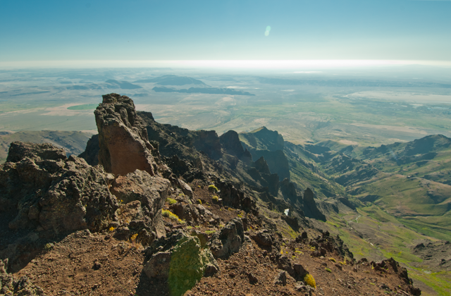
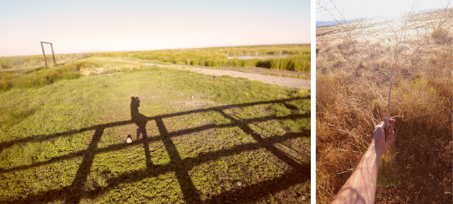
The entire region is populated today due to cattle ranching that started around the time of the Civil War. The decay of farms and the accouterment of moving livestock remain, baking in the sun, quiet and still. This is complete and utter solitude.
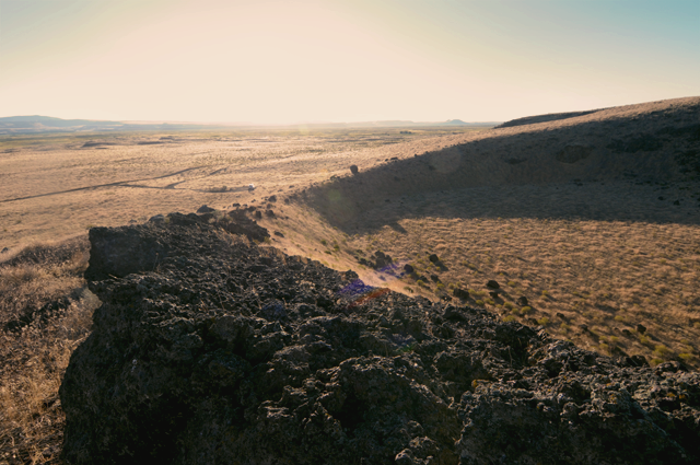
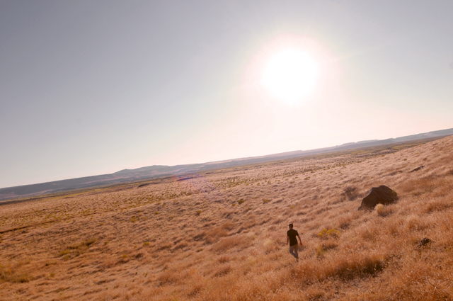
SE of the Reserve are the Oregon Diamond Craters, labelled an Outstanding Volcanic Monument, way out in the middle of the backcountry. Unpaved, black lava dust roads meander in and around craters that have been grown over, and remains of a lava flow that now reveal some rumblings in the past. I got out to huff it around one of the craters, and sunk in the soft lava silt the entire time. It was like jogging on a beach; difficult but oddly alluring. Beyond the craters the land flattens out and you can see for 40-50 miles. This county has very few trees.
While eating in the only restaurant in The Narrows (it’s on the map so it looks like a town, but in fact it’s just a gas station/RV park) I asked my waiter about distance here. He said “Yeah this open country really changes how 100 miles feels. For us, 100 miles isn’t really that far. It’s just a little drive to the next town.” In fact there is really only one incorporated area in the 10,000 sq. mi. county, and it’s the Burns/Haines community. All the rest is a collection of historic buildings, sleepy deserted farms, and houses strewn 20 and 30 miles from each other. The Oregon backcountry, as remote as it gets in this state.
The same waiter (well, he was also the gas station attendant, store clerk, and bartender) also informed me that “This is one of the biggest holes in America. The Great Basin is only talked about in Geology textbooks. There’s another hole up in Montana, and life’s hard here but I hate the cities.” He then told me that he thinks Portland smells like a fart. This is when I started to like him.
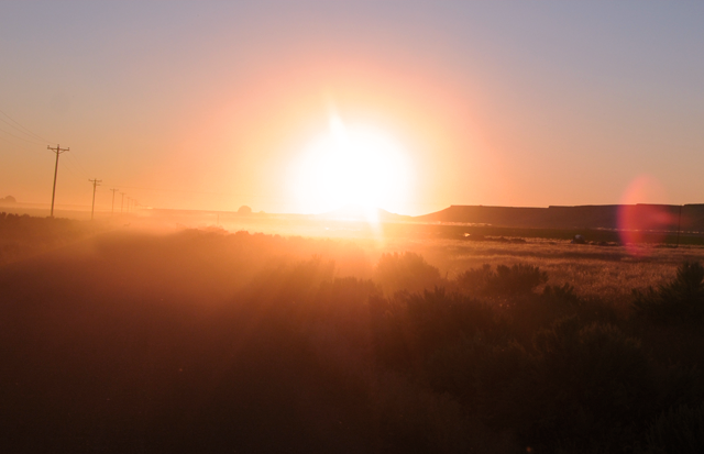
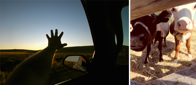
During 4 1/2 days I drove about 960 miles. Most of it was logged just getting out there, but I did a serious chunk of driving within the county, hopping from location to location. Easy to put on 150 miles just getting to a good spot and back before lunch. Windows down, shirt off, gravel roads, breeze on my body.
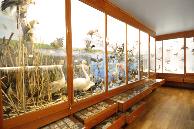
The Refuge headquarters is an oasis of shade and humans to talk to, and a museum of 200 stuffed bird specimens that can be seen in the region. There are about 340 bird species that use the Refuge either year-round or as a break from migrating. Many of these specimens and eggs were collected in the 30’s and 40’s, they are beautifully labelled and displayed with care. I remained in this room alone for quite a while before heading out to see the real thing just steps away in a nearby lake.
One of the unexpected delights of this “hole” in America is the access it gives you to our Solar System. Sunrise & sunset are magnificently spectacular. As are the star shows at night. I’ve never seen stars like this. Completely captivating display.
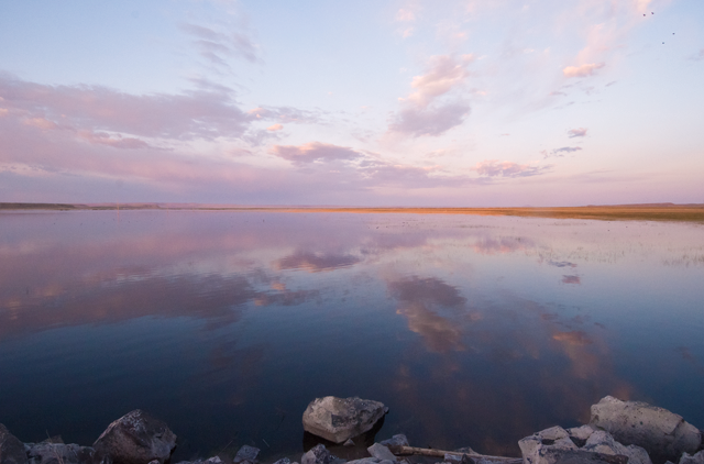
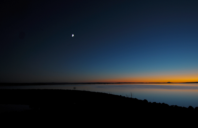
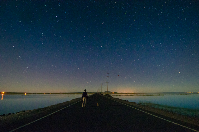
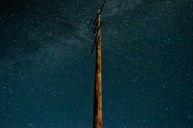
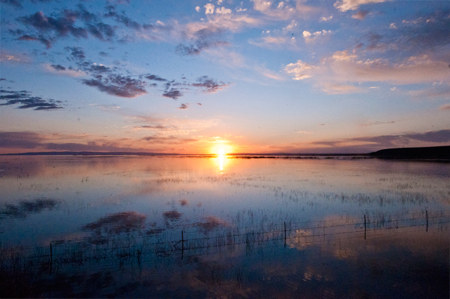
And, on my last morning before driving 7 1/2 hours NW back to my home in the city, the morning symphony of birds, the best stage lighting on our side of the Galaxy, and a new found love for another forgotten corner of this Earth. The chill of morning and an appetite for wonder are all I need for breakfast from now on. Sparkles.
Op Art Modernist case study, Burton Kramer
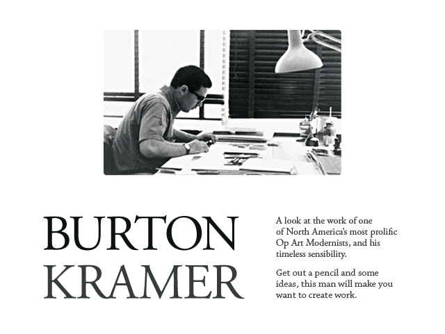
Most well known for his iconic, geometric, and order-based mark used for the Canadian Broadcasting Corporation, Burton Kramers’ work spans just over five decades, two continents, and too many design trends to count. Despite such a large breadth of time designing, Mr. Kramer has remained a seminal figure in Optical Art, modernist theory, and logic-based reasoning applied to design solutions. And then there is the beauty of his work, which rips right through the decades, and into relevance in 2011. Here is a small smattering of his works.
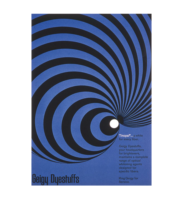
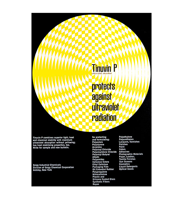
These two pieces were created for the Geigy Corporation in 1960.
The black, white, and blue poster at top is worth mentioning as a concept, style, and technical illustration of a product. Kramer is showing a type of brightening agent for fibers abstractly represented by curvilinear radiating lines. Similarly, the black, white, and yellow piece below it, another abstracted yet technical concept is presented through geometry and optical confusion.
To qualify as Op Art one generally works with color vibration or black & white illusions between understanding and seeing. Kramer isn’t trying to trick our eyes here, but since the pieces above were created 4 years before the term “Op Art” was coined by Time magazine, I’ve included them in the idea of what Op Art expresses. In my opinion the display of abstract shape specifically to optically express a concept or mood should be included in Op Art. Largely because even if there is no visual movement, there is still a deliberate illusion between picture and plane.
Burton Kramer wasn’t the first to try and confuse picture and plane, but he was on the leading edge of applying it to graphic design and the modermist movement. A skilled draftsman, here are his comments on his process when the two pieces above were likely created, pulled from the book Burton Kramer Identities:
“I needed only a drawing board, a t-square, some triangles, pencils, a sharpener, a desk lamp and a chair. Now one needs a computer, the largest monitor possible, a scanner, a printer, software, a copier, a fax machine, etc, and it all costs.
Clients believe everything can be done overnight, and want to see “options.” It’s a bit like baking three or a half dozen excellent cakes, choosing one and throwing the rest in the waste container.”
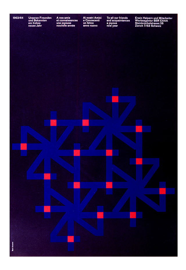
This New Year Greeting card was created in 1963 while Kramer was working in Zurich at Erwin Halpern Advertising. The orbiting Z forming snowflakes or fireworks set on a black field, perhaps the night sky of Zurich, completes an image that is trend-free in the sense that it is still fresh, still hot, and will always be dynamic. Kramer then chose to merge this linear expression with the Swiss/International Style of displaying information. There are many reasons these things last. Similarly principled works can be found by checking out Josef Muller-Brockmann, Armin Hoffmann, and Alvin Lustig.
*Edit: I’ve been informed by Mr. Kramer that the “Halpern new year greeting is based on the number 4… for 1964, not the letter Z for Zurich…but that’s OK.” – Thanks for the correction!
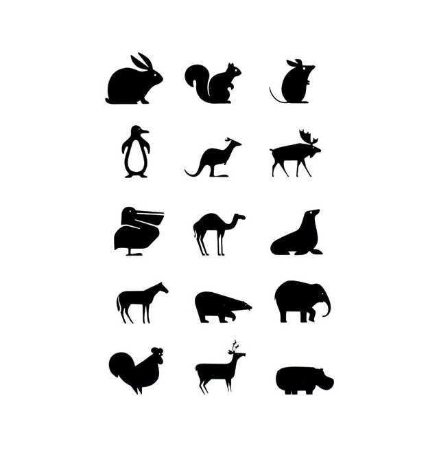
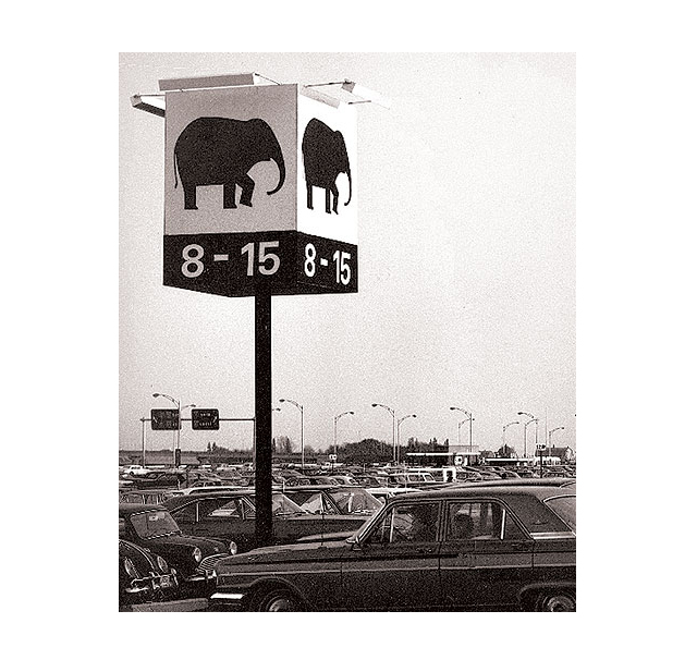
In 1967 Montreal hosted the International and Universal Exposition, and was later heralded as the most successful World Expo of the 20th Century. This meant the task of way-finding for up to 1/2 million human visitors per day was a serious and important undertaking. Kramer devised a series of pictograms for two massive parking lots, and continued his use of repeated imagery throughout the exhibition area. if I were born 24 years earlier, I’d probably find myself driving to the animal of my preference and parking directly beneath it to marvel at these awesome icons.
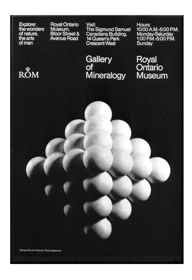
Later, in 1967, Kramer decides to utilize realism coupled with the International Style, in a poster for the Gallery of Mineralogy in Toronto. I can imagine some amazing rectilinear shapes as a solution for this one as well, I find it interesting that he opts to use realism and circles for this piece. Also I’d love to know if he worked with the photographer to build the model or if this was scientific scale model of atomic structure. The gradation of shade and alignment of the form are optically mesmerizing.
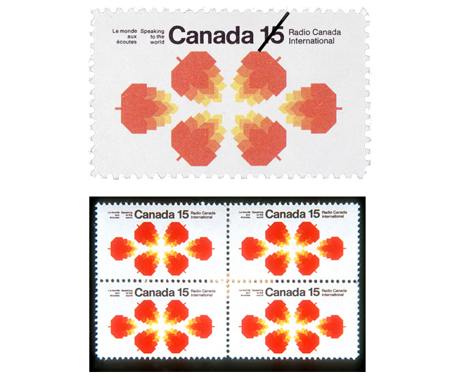
In 1970 Kramer designed these stamps for Radio Canada International, which may have been a preview of coming attractions, as 4 years later Kramer was commissioned to design the identity which he became most famous for, the logo for the Canadian Broadcasting Corporation, another radio company.
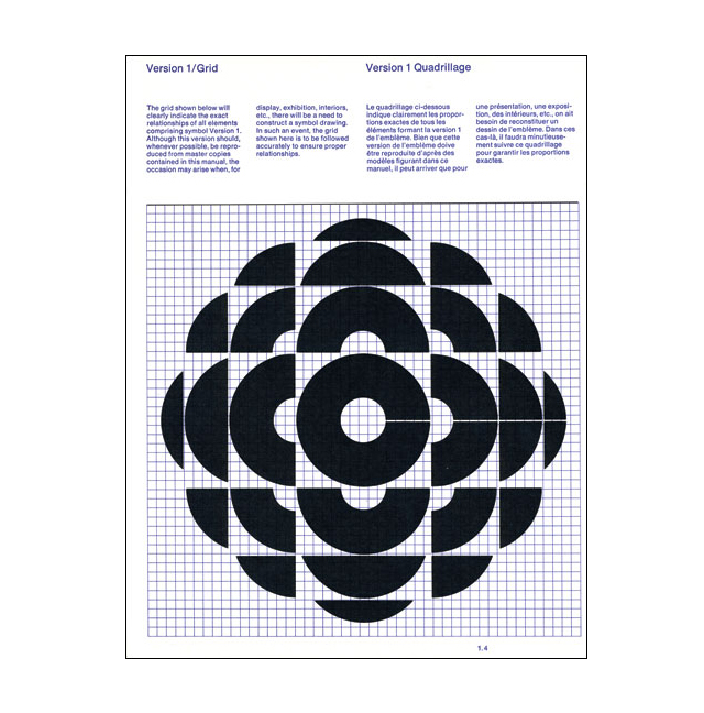
The Canadian Broadcasting Corporation (CBC) asked Kramer to redesign their identity in 1974. This has become his most famous identity and legacy as the company retains a simplified version of the identity today, and maintains a very high profile in Canada, similar to CNN in this country.
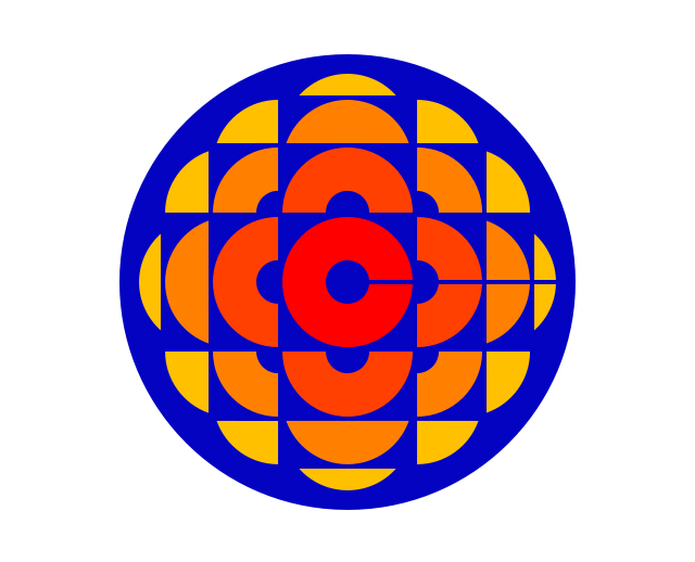
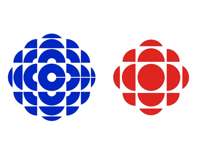
The original red, orange, yellow, and blue mark was unveiled in 1974 and served until 1986, when the single color gem logo took over, until 1992. The simplified red version is still in use today
(see it in action).
In addition to this icon, Kramer consistently created marks that are difficult to determine their decade of origin. This is consistency and talent applied.
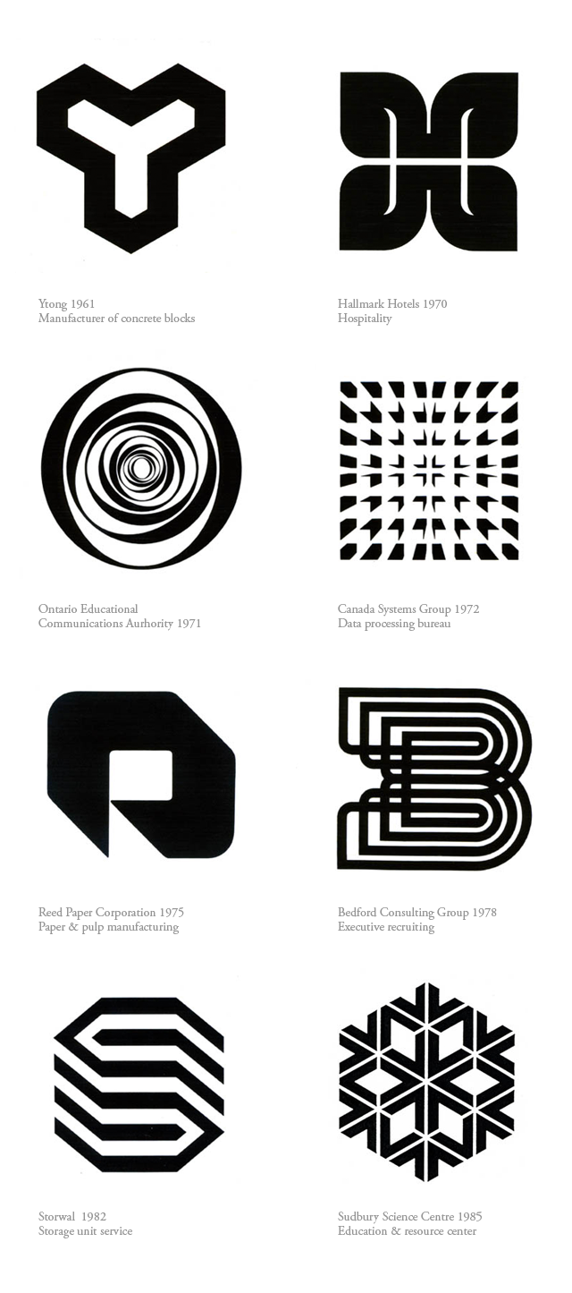
Mr. Kramer spent years working in Europe, Canada, and the United States. When asked about the major differences in working in these locations, he answered as follows:
“In North America, with its generally anti-intellectual, anti-art, pro-sport and pro-gun culture, design was viewed as a ‘frill.’ It was never part of the mainstream culture, if we must refer to pop culture as culture.
In Europe (Switzerland specifically), if I told someone I was a Graphic Designer, they knew immediately that I was a working professional, and that what I did was important.”
UnFailed Fail show
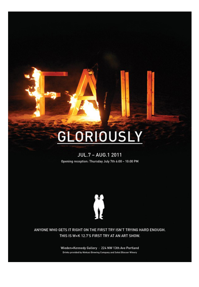
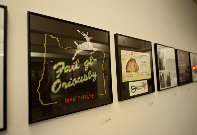
This is the invitation for Wieden+Kennedy 12.7’s art show that opened yesterday on First Thursday.
This is how much I love it (arms open).
I accidentally stumbled upon some of the 12’ers late one evening in the studio putting together some elements for this piece, I had no idea they were going to pull off something this beautiful. I almost feel like I could just end the post right here. I can’t tear my eyes away. I find it equally surprising and beautiful.
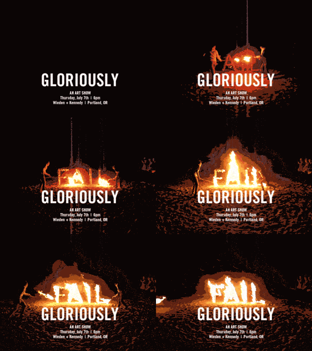
One of the underlying themes of W+K 12 is Fail Harder, which can mean alot of things. But what it screams is that it’s important to take big enough risks that you might fail, and fail hard. Like a burning airplane over a lava field and no captain. Like losing everything. Fail Gloriously is this group’s first art show. And they killed it.
The group decided to ask all the former alumni of 12 to submit one piece for the show, and required that it be 12 x 12.” Then they waited for entries and arranged them in a single line around the W+K gallery space.
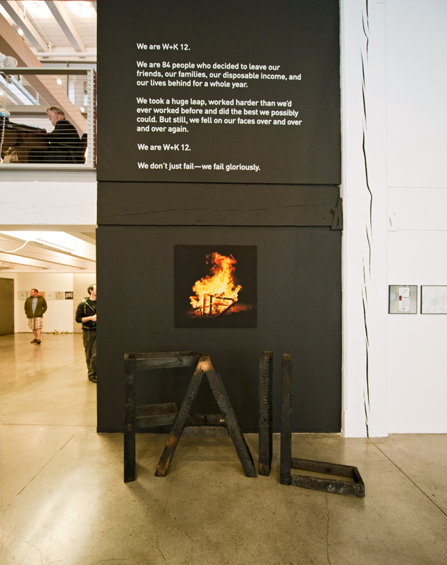
That copy!
This is beauty.
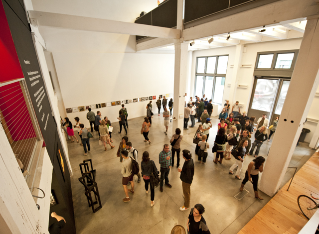
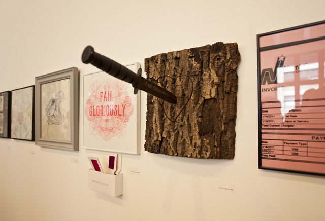
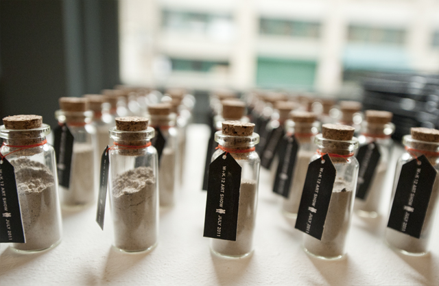
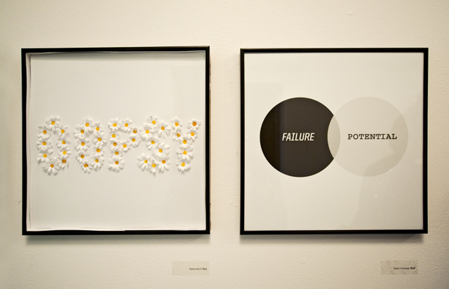
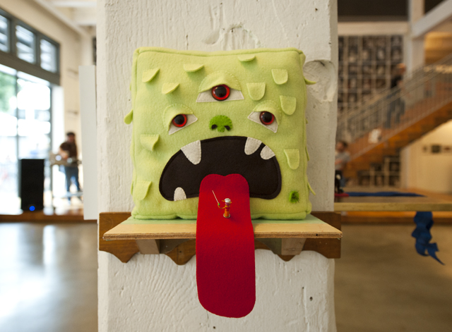
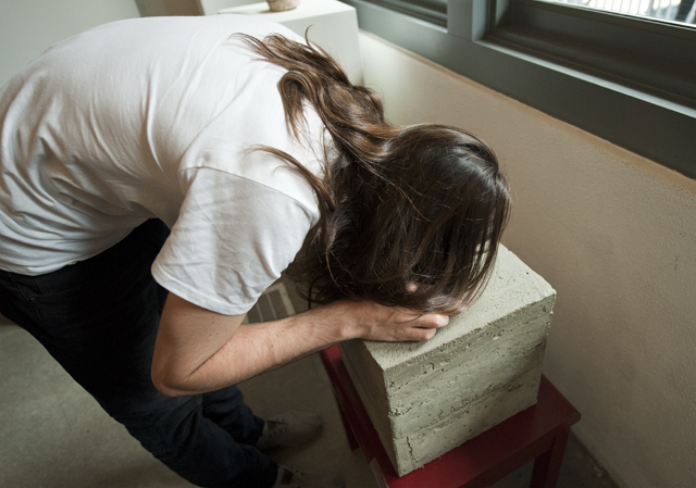
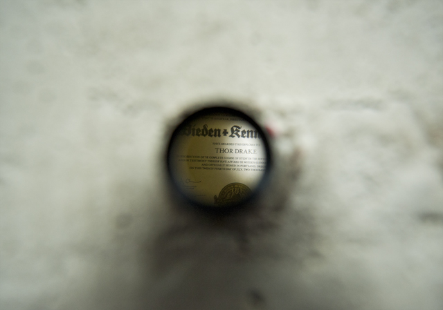
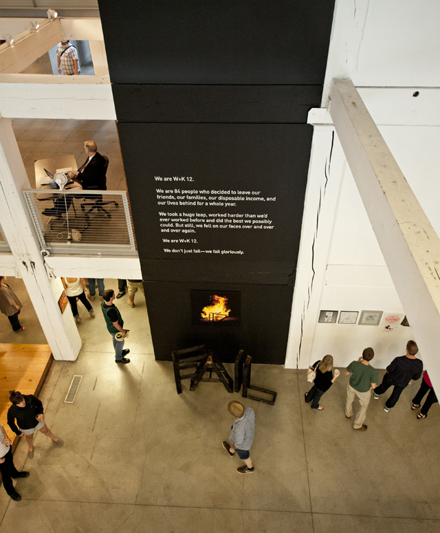
I’m not even in 12 and I don’t want this year’s group to ever end. I’m sure that feeling isn’t mutual, group dynamics are complex systems. It’s like when you get attached to reality TV people. I see them, but I’m not really involved. But they’re in my head, and this show pulled grey matter from the heads of all previous 12 years. So thoughtful, I love this idea and I’m still excited about it. Come check it out if you are in Portland, it’s open to the public until August 1. Bring a camera.
It’s Official. It’s a co.
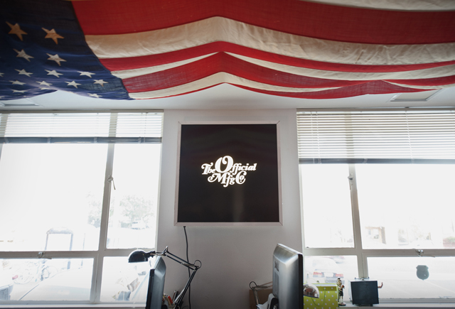
The fact that FORTPORT has not featured OMFG co. yet is practically a crime.
It’s nearly impossible to be in this town and not be exposed to their stunning array of works strewn about. The three men behind the odd acronym (which when I first heard it looked like swear words, condensed) are Jeremy, Mathew, and Fritz. They have been working hard building out and polishing up a new space for their creative efforts at ADX Portland and were kind enough to have an open house. This post is aimed at strengthening the design community in Portland, and expressing what excellent people are drawn to OMFG co. Because they kick ass.
And when you work as hard as these three, you gain some respect. And when you are as kind as these three, you gain some friends. Oh and they are humble, and happy to see you. If you get a chance to work with them, their first order of business is probably hugs. We hug you back guys, because after the hug you produce some dope shit.
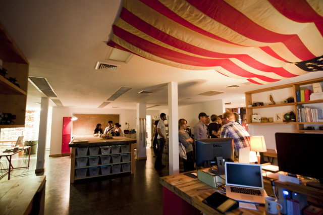
The OMFG co. catalogue of work is worthy of several posts, so it’s no wonder their new space is perfectly fitting, perfectly authentic, and designed to function. Bike racks, a kitchen, blackboard, studio table, labelled drawers, and a 48-star Old Glory accompany built-out shelves and work stations. A collection of cameras (vintage, holga, polaroid, you name it) takes up two shelves and a meeting room with a slowly flickering electric fireplace are just a couple of the treasures in this place.
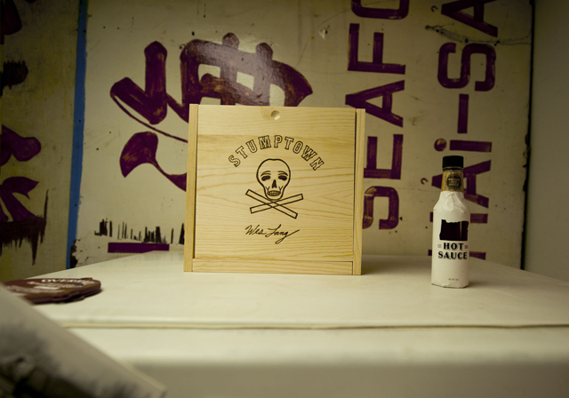
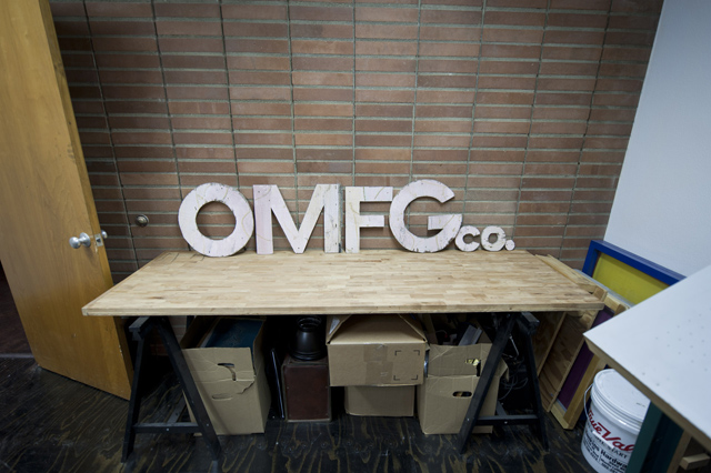
Screenprinting stations, a workshop with all the tools you need, a letterpressing station, and dreams come true for any designer are what you will find here. All to support the work that is fueling their momentum.
Now for some people.
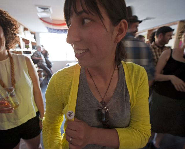
Elsa, 1/2 of Always With Honor, and a knit. shrimp. button.
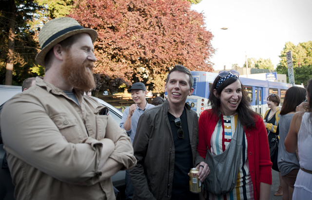
Clifton Burt, Duane King, and Kate Bingaman-Burt. Get these 3 in a single frame because they are magic. This is what a supportive design community looks like.
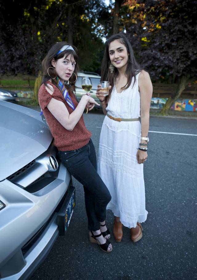
Victoria Mesenbrink (in white) with one Jessica Hoffman – both part of the real OMFG co family.
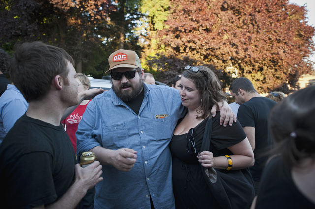
Aaron Draplin and his lady Leigh with the bracelet that stole hearts, these two are true blue American working heroes. This is true. Consult the internet.
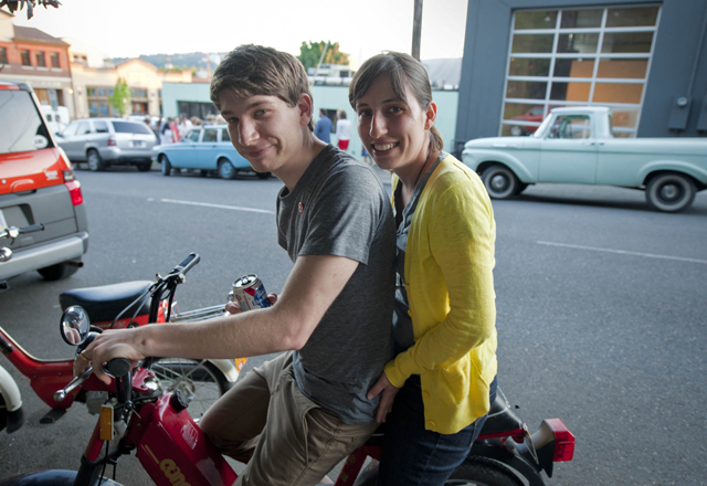
100% of Always with Honor on their awesome rides. No helmet + PBR on a Portland summer evening. What?
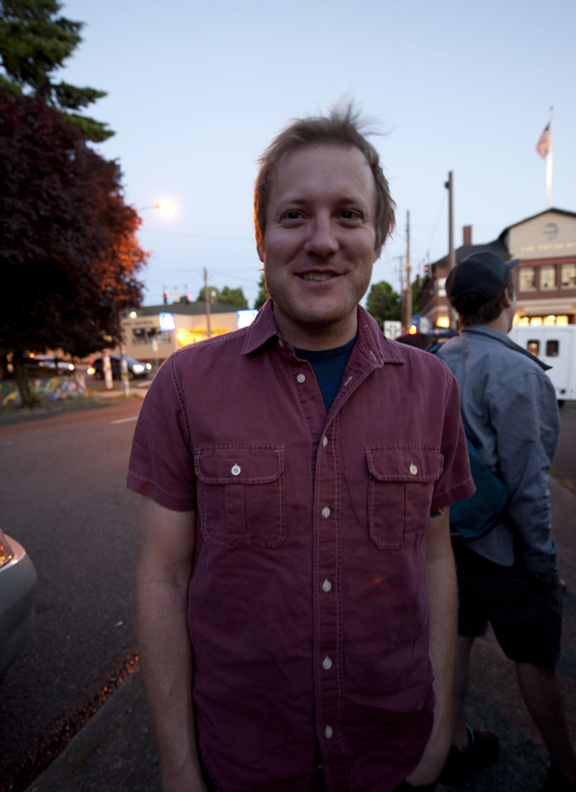
It’s been forever since we mentioned Portland’s finest poet, Zachary Schomburg, awesome that he showed up to support the co.
These were just the people I could grab & snap, there were hordes people. Hordes. A tight, interconnected working network. Basically the entire breadth of the creative community in Portland. Seeing their new space was one thing, seeing their network was another. Quality people are clearly drawn to each other, and it was an awesome lesson in human-ness. Work hard, be nice.
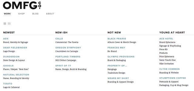
In addition to the space, OMFG co. launched their new website on the same day. Look long and hard folks, this is how things are made.
