Ellen McFadden
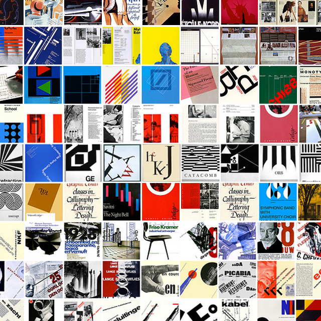
My graphic design education effectively began on Flickr. Class critiques were conducted there, and it was the first place that I really started to explore all the ways that people were communicating visually. It was on Flickr that I also began to explore design history, and started to connect the dots between the graphic trends of the moment and the masters that these trends were emulating. It was also around this time that a professor introduced me to Ellen McFadden’s Flickr account.
It blew my mind.
Within this Flickr account lies one of the most comprehensive graphic design history references I have ever come across. Spanning decades, movements, styles and technological advances Ellen McFadden has succeeded in collecting and cataloging the history of the visual communication craft. Not only does she present the material in a meticulously organized fashion, she also provides the viewer with her own comments on many of the pieces. This collection paired with McFadden’s expert observations combine to become as exhaustive a design history course as you will find in most undergraduate classrooms around the country.
This is the kind of collection that only a true curator and educator could put together; Someone who so values sharing knowledge above all else. McFadden, born in Portland, Oregon has devoted 30 years of her adult life to design and art education all over the country. After studying calligraphy at Reed College under the master calligrapher Lloyd Reynolds (the same Lloyd Reynolds who Steve Jobs credits as having imparted to him his love of typography) Ellen went on to teach in Washington, Idaho and Iowa before returning to the Pacific Northwest and ultimately landing back in her hometown of Portland.
This is where the plot thickens. If Ellen McFadden were just an educator and curator she would have more than done her part to bring knowledge and beauty into the world. But there’s more.
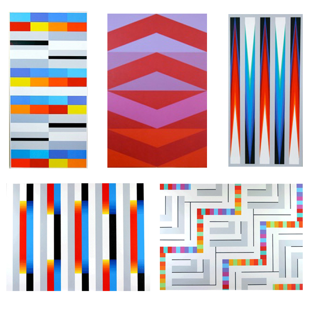
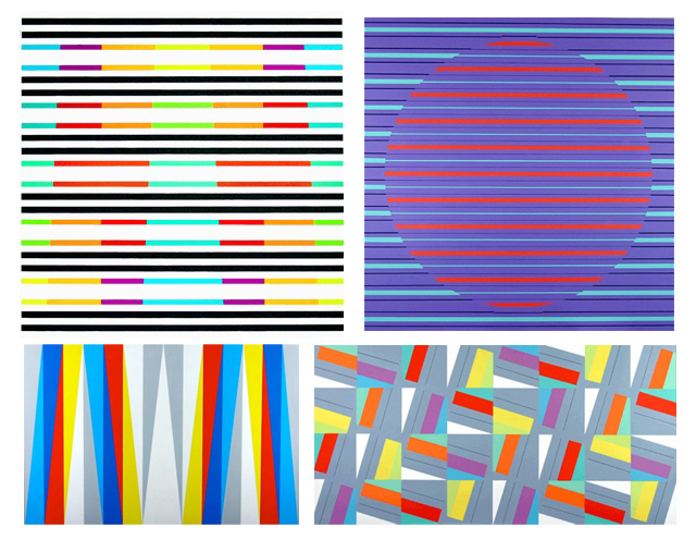
She paints. In her “retirement” Ellen has turned to painting these incredible, geometric pieces full-time. Her paintings feel like some sort of Pendleton print for the new millenium expertly balancing color and pattern. The results feel incredibly fresh and graphic with a look of something that might have been produced digitally, but it wasn’t.
I’ve intentionally saved the links for last because if I had given you access to Ellen’s Flickr page or Personal work, you would have left immediately and never returned to finish my post.
40,000-piece textile archive
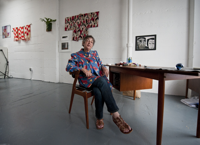
It was an accident really that led me to Andrea Aranow. I was working in the Goldsmith Building in Chinatown when Caleb Sayan poked his head into the studio. He was looking for Jelly Helm. In his stead I followed Caleb up to to the fourth floor and caught my breath when I walked into what is the largest private textile archive in the world.
Caleb mentioned that his mother, Andrea Aranow, was flying in from New York in a few weeks and what started as an act of curiosity ended in a film project.
Andrea Aranow is a New York-based textile collector and clothing designer. Her design holdings, however, are housed (archived) in Portland, Oregon and consist of over 40,000 pieces in total, meticulously archived in a digital collection.
Andrea’s collection is as vast as it is stunning. Her holdings can be found in museums across the globe and include some 700 Kimono, 26,000 swatches and designs, and decades worth of research done in China, Japan, Peru and the United States. She has a history of sewing, making, and dressing. Her storefront in the lower East Side of Manhattan housed patrons like Jimi Hendrix and Miles Davis. Her holdings have been the curiosity of the House of Alexander McQueen, and what’s more is that the majority of her design collection lives now in Portland. It has been meticulously archived in its entirety, piece by piece, photographically categorized by composition, era of origin, and technique.
This is a collection to write home about. So instead of writing a nice note to your mother, watch this video. This couldn’t have happened without the generous support of Caleb Sayan, Blue Rider Design, and Andy Chandler.
Ryan Bush and I worked together as co-directors, editors and producers.
The creative corridor of this town is absolutely magnificent, and it’s very exciting to share with you.
Invisible Creature with Don Clark
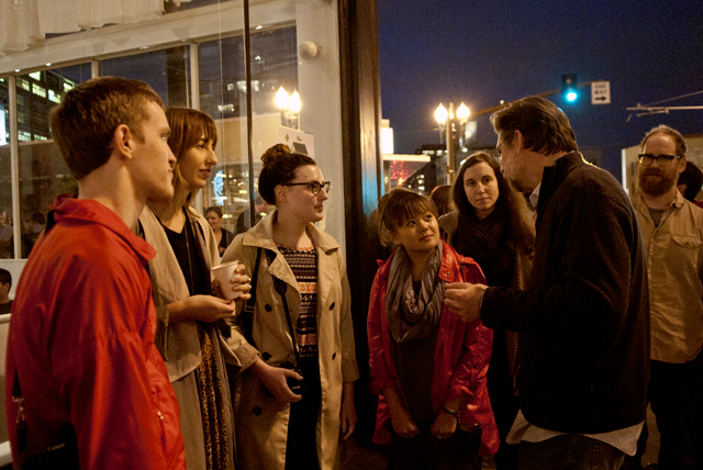
Two cities, two houses of design, one community. The Spit Swap has happened, and not only was it informative/inspiring/radical, it was engaging. Here’s the thing with being engaged, it leaves you better prepared to create things worth sharing than passive involvement. I never feel like I just attend a Designspeaks talk. They actively engage, so in fact I’m paying a few bucks to get mobilized. It’s a briefing, if you will, on what I am about to do with something inspiring.
The image above is a complete representation of what Designspeaks is and hopes to be. The coordinator, Eric Hillerns, dropping knowledge on four current design students with the Bingaman–Burt’s close at hand. What value is there to a student of design that is thrown into the industry and given experiential knowledge from practitioners? Effing tons (dropped-knowledge receivers from left are Ryan Bush, Corbin LaMont, Allison Berg, and Tina Snow Le).
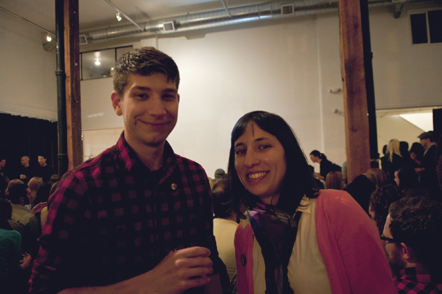
As a bonus to the night the photogenic Tyler & Elsa Lang that constitute Always With Honor introduced Invisible Creature. Who knew the stage loved these guys so much? Let’s just say they closed with claps and giggles from the entire room in a casual sort of “we’re pro’s at this” air. Hidden talents guys.
Don Clark (along with his brother Ryan) are the smart & talented designers behind Seattle-based Invisible Creature. Well they are more than designers. They are illustrators, rockers, talkers, culture creators, and recent Designspeaks alumni. As usual The Cleaners at the Ace Hotel hosted a room bursting with eager ears, tasty snacks, and a talk that left us all whispering greatness to one another.
What I appreciate greatly is that Don spent the better part of his talk explaining his history. Starting with his Grandfather, who was an illustrator at NASA for 30 years, Don laid out his path in a linear fashion to where he is today, working in Seattle with his brother, doing some of the sickest work on the West Coast.
From Bend, Oregon, to Sacramento, to where he is today in Seattle, he like most humans was inspired by a variety of media that came before his eyes. Specifically, however, were the snowboarding and hard rock music scenes of the early nineties. Music was and still is a large part of Invisible Creature’s focus and source of inspiration. From album covers to the poster explosion to the music itself. Don spent some time talking about several moments in recent design history that shook his sensibilities and direction, like Sagmeisters first book, or watching the animated film The Incredibles.
After a few of these jolting/illuminating experiences, along with having children, Don & Ryan shifted their focus from music to packaging, drawing & character illustration. They began to see Alain Gree and Richard Scary and all the ideas of modernism in a new light. Crashing through the fear of getting pigeon-holed, the pursued their heart’s directorial pull and started to create some iconic work in modern character illustration.
At the end of the talk and after showing some great new work, one person asked “When are you moving to Portland?” in an act of admiration. Don answered immediately “I’m not worthy to move to Portland, I’m the least cool person on your streets.”
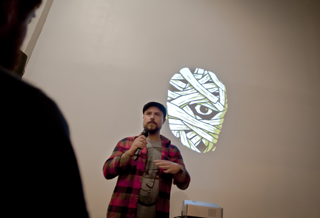
And that’s the thing about Invisible Creature. They are humble, and they will advocate for you. How many times did I hear the phrase “It’s an honor to be here” during this talk? How often did Don mention the people that he looks up to? In the end the whole talk was a big “Thank you” to the supportive community that is flexing its young muscles in the Pacific Northwest. In this instance, Eric Hillerns, Duane King, Lloyd Winter, Aaron Draplin, and Designspeaks deserve some admiration. Is this how you pull people together? Yes. Is this how you spread talent in the interest of inspiring?
Yes.
There is a reason there are no seats, why people are willing to stand in the back for over an hour. And it’s not the free beer. For less than the price of dinner and a movie, people leave with full heads and soft smiles. It’s an evening for your hands, eyes, and thoughts. Hey students, there isn’t a price-tag for this sort of thing.
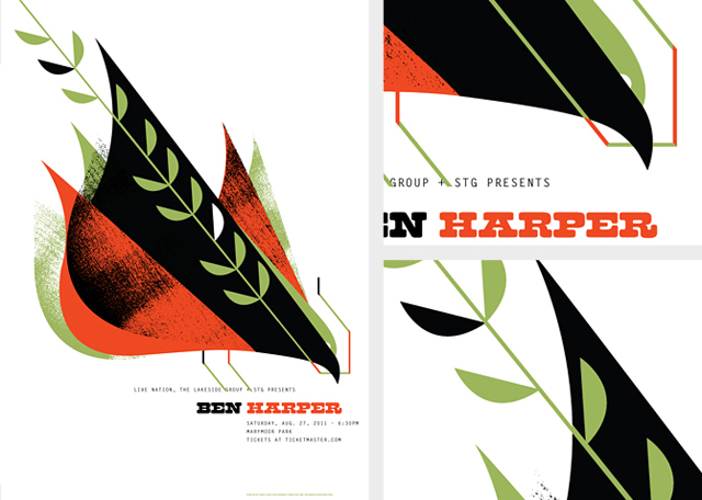
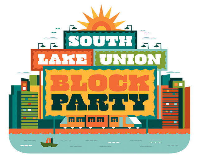
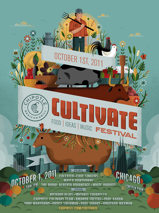
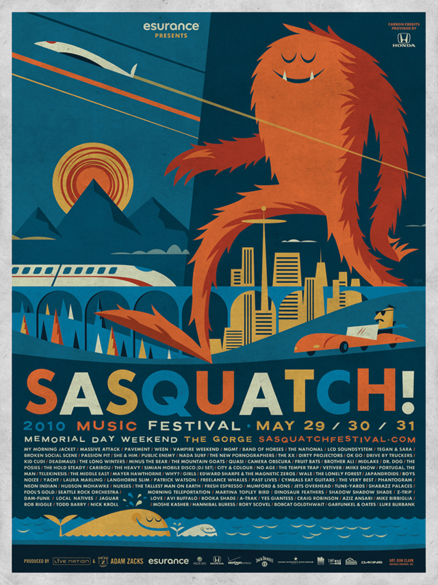
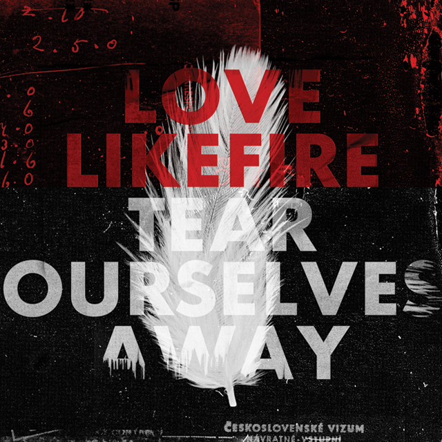
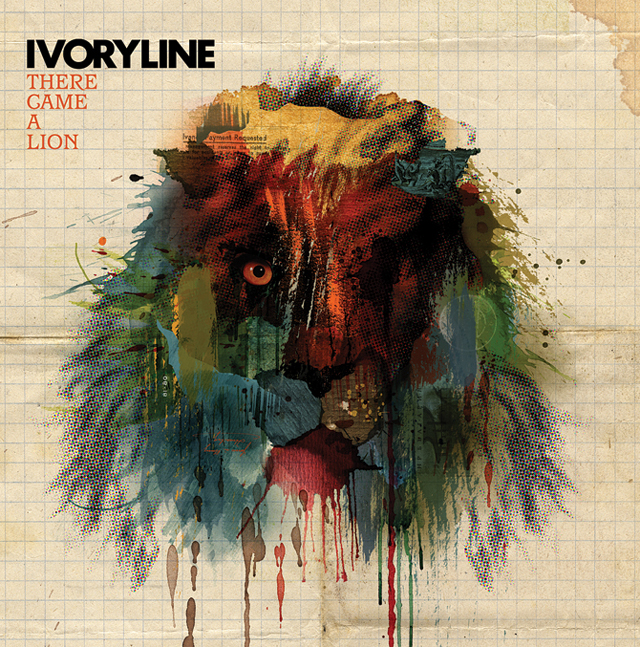
Check out a SMALL sample of the work, much more here, including characters, history, a shop, and an awesome blog chronicling these Seattlites experience in Portland!
Badge design & inspiration
Badges are pretty much everywhere.
Some people aren’t willing to call them logos, arguing that they’re just a trendy piece of graphic eye candy, soon to be dated, and not really worth pursuing in your own work. Others think they’re beautiful and should be plastered on everything from skate decks to the Lakes of Minnesota. Recently there was a blog post from Allan Peters curating his favorite badges of the internet, which has strangely disappeared. Where did this post go? Anyone have a lead?
Since it’s gone I decided to make one of my own, with a bit of a study on what makes these little marks nice to look at, and perhaps a challenge on how to move forward. Not wanting to waste time on trendy graphic treatments, it is important to recognize what’s being made, and how to make it our own (which is to mean at times, better). In this process we then need not worry about our work becoming dated, only about using successful elements of design and applying them to our work through our way of seeing the world. Foundations!
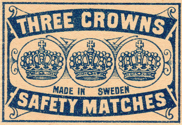
It appears that many elements of the badges we’re seeing today can be found in 19th century advertisements like these:
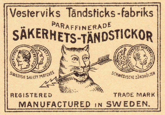
This may or may not qualify specifically as a badge, especially considering the bounding rules which makes me think it’s an ad from a newspaper or catalogue for safety matches, but the elements are there. A balanced approach to all the elements, as if hanging from a middle pole – the iconography is surrounded by type-on-paths. There is a ton of type here, and I’ve seen badges with what seems like paragraphs of type contained within them. In fact the badge allows much more room for type than a traditional logo does. Perhaps this is part of their main advantage, the ability to express typographically.
Some logo designers would call this a crutch, as it’s more difficult to express ideas and concepts visually. Hence, the craft of logo making and why it has value. Does the badge undermine this value?
Another similarly dated pice begins to show even more elements in use over the last couple of years. Banners or ribbons containing type, elipses-bound icons, and an ovoid composition. Keeping these elements in mind as you scroll through the badges below will help identify visual trends across most of the treatments. This example above is particularly reproduced in terms of type choice. Take out the bounding rule, the ornamental lines behind the crowns, and you have something that could have been made in 2010.

A couple more examples of graphic elements from over a hundred years ago that are used today in badge design:
![]()
If you can look past these subjects, the treatment is largely the same. Add some type outside those elipses, something all caps, perhaps a stacked Gothic with an inner stroke and you’ve got the beginnings of a badge. Heraldic icons especially seem to be popular, along with the accompanying shapes. Shields, circles, crests, chevrons, boy-scout or military-inspired nuances, and type-on-paths all play together in this trend.
For now, let’s just look at some straight black and white badges with these elements in mind. Side note: All of these images and their sources can be found on my Designspiration saves.
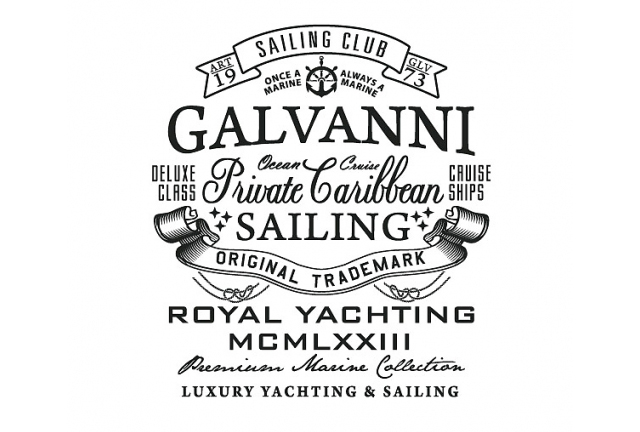
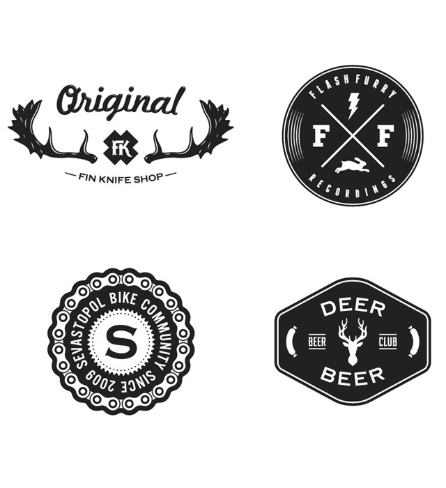
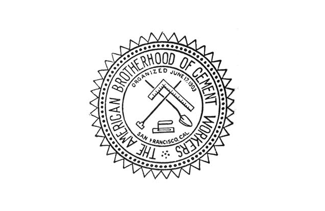
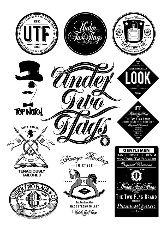
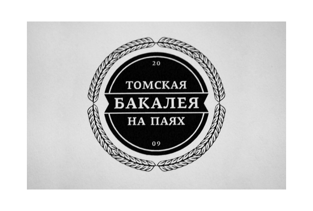
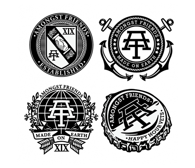
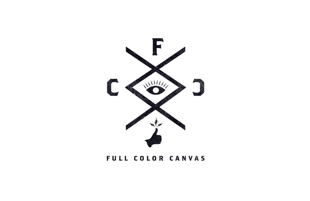
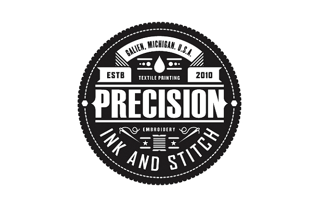
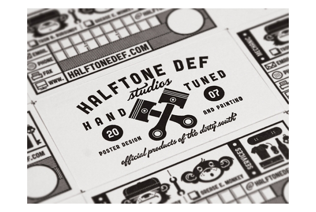
Now I’m realizing that this post is going to be huge. Nothing like an exhaustive resource, right?
Ok let’s keep going campers, and let’s add some color. Looking at these it begins to be clear that many of these badges would not work as traditional logos, there are so many small elements that just would get lost at smaller sizes. So perhaps the badge is an internet-logo? Not to be seen in print? Who knows.

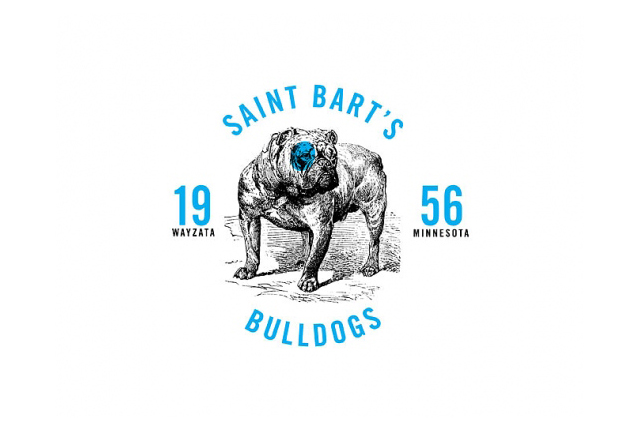
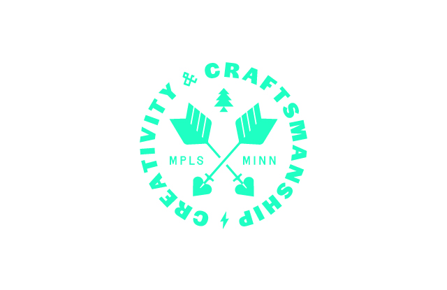

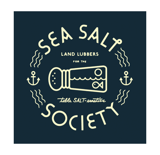
Ok everyone still alive?
The final installment of this badge inspiration mega post is the badge upon image. When the right image is placed with the right badge there is a bit of magic. The sad thing is their uses are a little limited, but they’re awesome nonetheless.
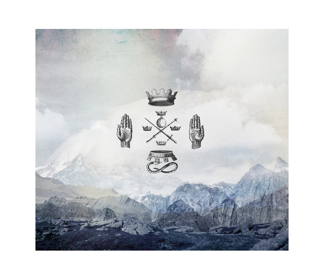
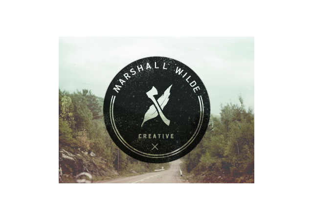
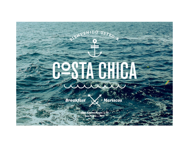
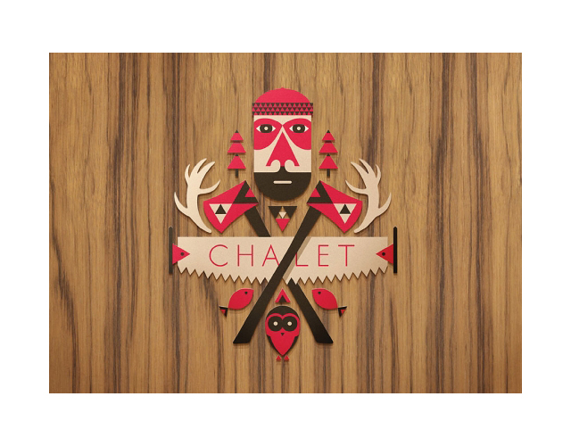
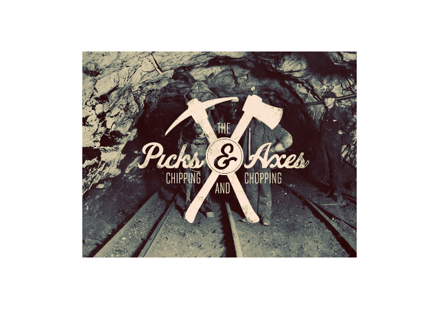

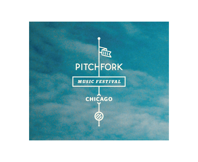
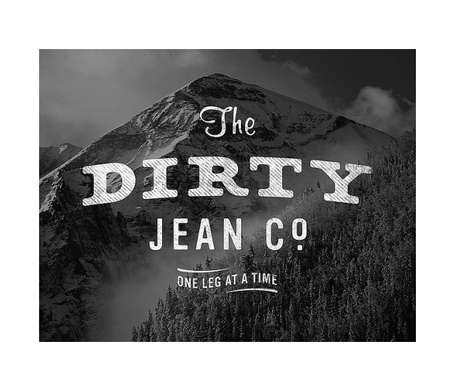
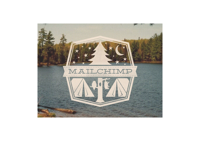
Safe to say I want to create better badges now.
Will Bryant, Please!
William Bryant just moved to Portland via Austin and just killed the New York Times Magazine front cover with the illustrated question of the year “What if the Secret to Success is Failure?”
This man can draw, and he draws everyday. Plus he’s humble and nice and hard working.
So that’s amazing.
Mr. Bryant has been generous enough to share some process sketches and below is the cover on the NYT website! Holding this thing in-hand walking around town definitely gets some looks.
It’s magnetic!
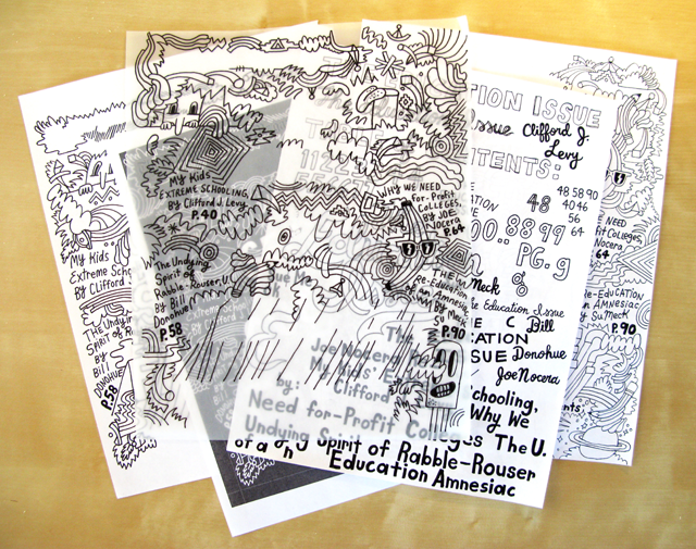
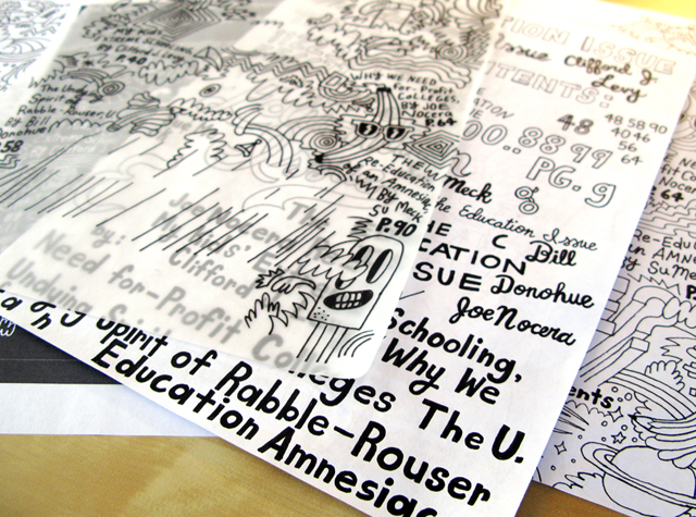
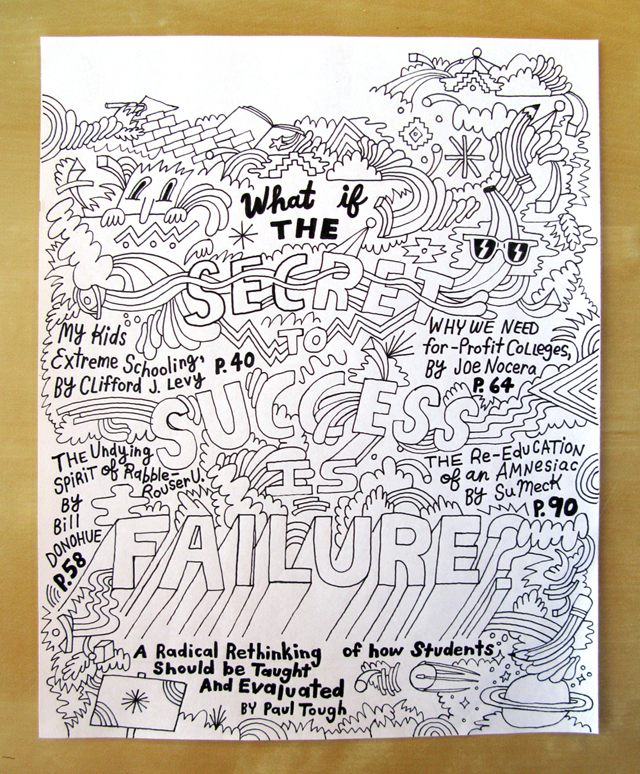
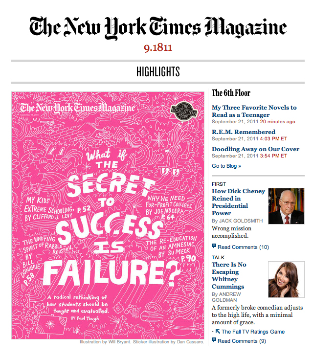
Is that pink? In person it’s practically hot to the touch. I think it’s radioactive. SUCH a strong move for the magazine, their covers are always amazing, thought-provoking and mesmerizing. This case is no exception, it’s quite fun to find new elements in this piece. It belongs on a wall, in a frame. They type, the weirdness, the childlike enthusiasm, all swirling around that amazing question so many people have been asking. Staring at this cover yesterday probably influenced my decision to watch Secret of My Success starring Michael J Fox last night on Netflix, which contains probably the most well known limo scene in film history. Will, did you listen to “Oh Yeah” by Yello during ANY of these drawings? Be honest.
In addition to scoring on this editorial piece made of dreams and talent, Will has a complete catalogue of kick ass illustrations, drawings, artwork, and design pieces under his belt. Is this what you call prolific? Is it any wonder that he studied and works very closely with Kate Bingaman-Burt? No surprise at all. One could do a series on all of Kate’s former students. It wold be long, and awesome.
Check out some of this work! Will famously says “I make stuff because I get sad if I don’t.” Amen.
More on his website, blog, and twitter.
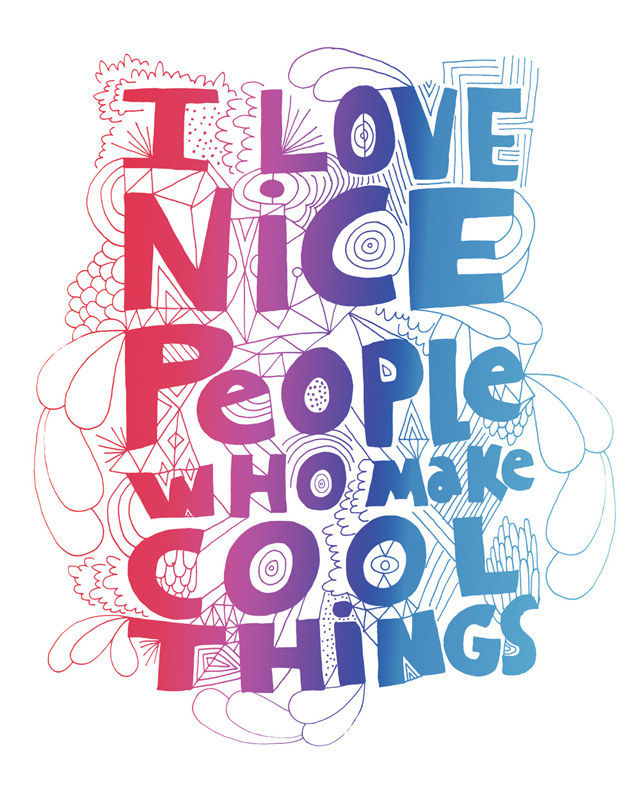
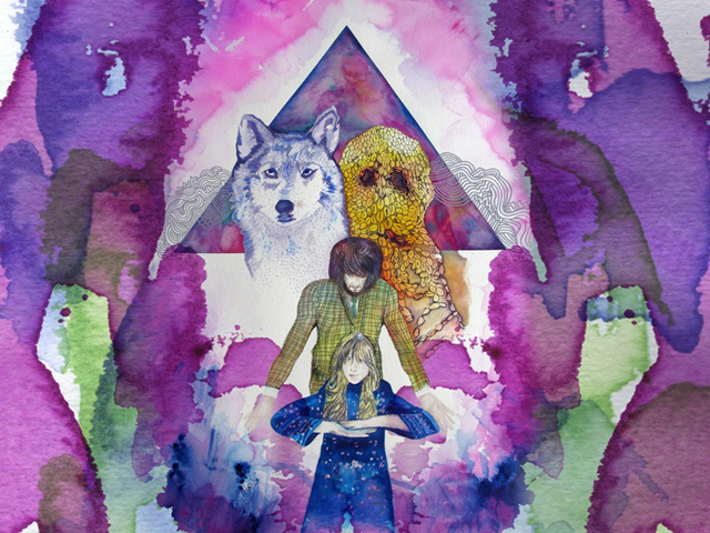

The above 2 pieces were done for Kitsune Noir before Bobby changed his blog name to The Fox is Black. They were for a desktop wallpaper series that I think is still going on – I remember being in school and seeing these and realizing how awesome they were. It’s fun to have as a friend someone that you look up to and was part of your design education. That makes Will sound really old. In fact I think I’m older than he is. Suffice to say Will has been making dope work for years!
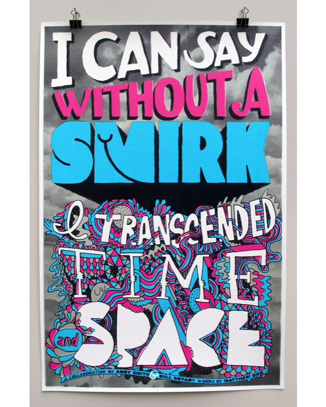
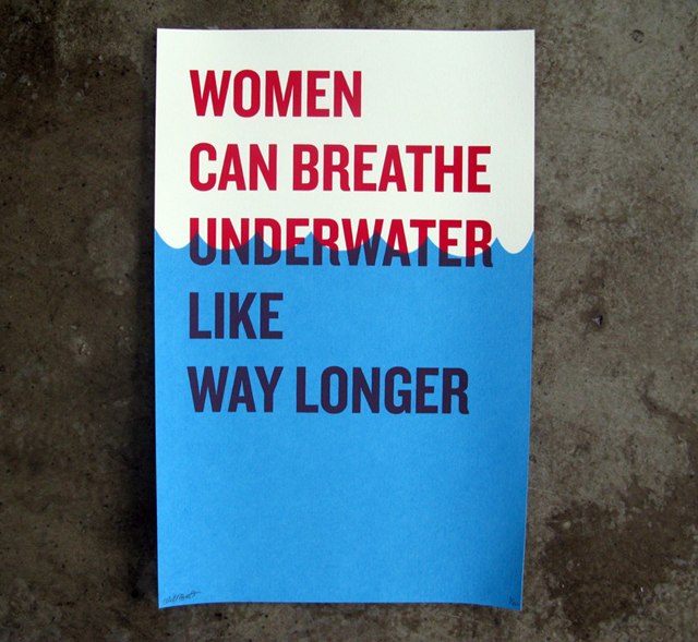
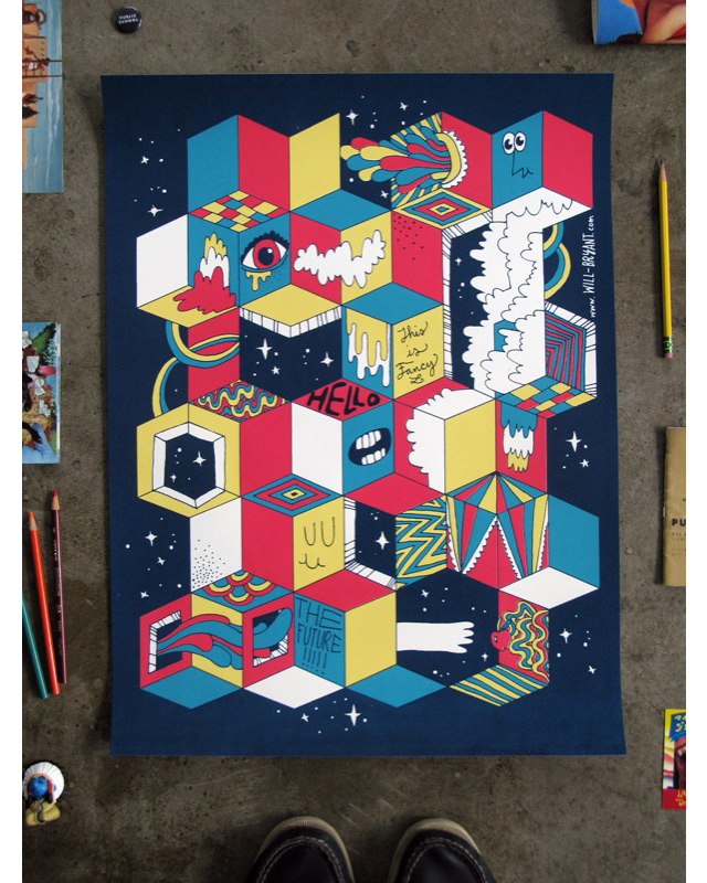

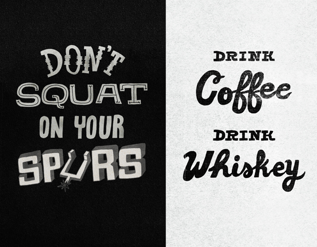
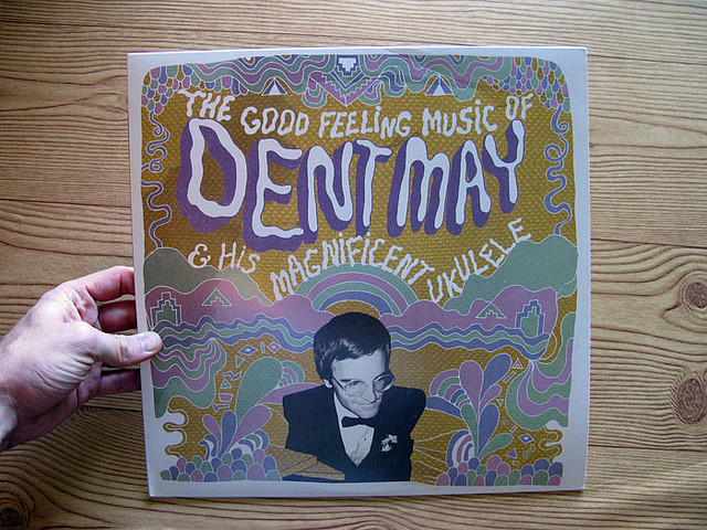

Will came to Portland in November of 2010 and had a solo show at Land Gallery, which was excellent and amazing simultaneously:
