TEDx PDX Preview
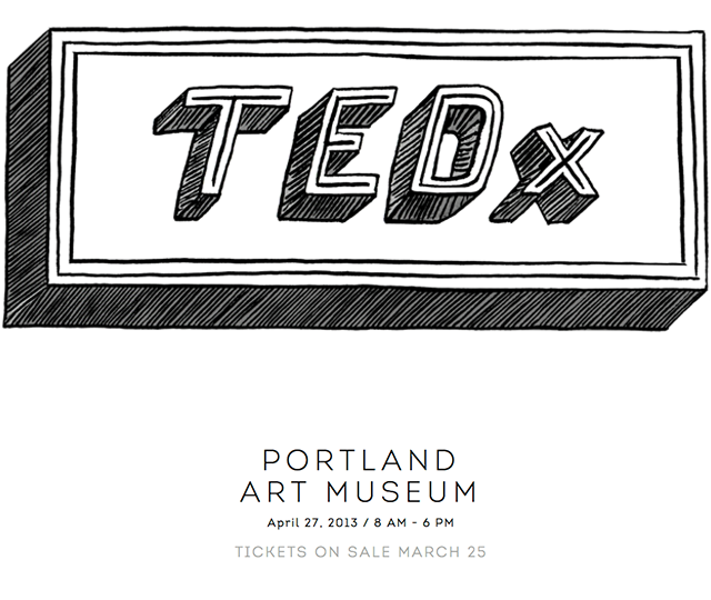
Year 3 of TEDx Portland starts on Monday.
Well, ticket sales open Monday, you still have a month to look forward to this lineup, a full day of amazing speakers, an art show, and a surprise event before hand that will excite any TED fan. Yeah, TEDx is a franchise. But it’s our franchise. Our flavor, under the global TED umbrella, it’s Portland’s very own in a rad series of what is turning out to be fertile grounds for a short-list of inspiration-heavy conferences. This one is just, you know, globally recognized. That’s all.
And guess what. This lady is talking:
Yeah. I TOLD YOU. But also check out the lineup, if you don’t know who they are and want their bio’s, vist tedxportland.com. I love the decision to make these humans’ faces front-and-center.
So beautiful.
So, tickets last year sold out in 2 hours. Monday is your window, if you want to be a part of this, sit on your browser like you’re looking for an apartment on Alberta Street. Refresh, refresh, refresh. If you can’t make it or time slips through your hands, you can count on FORTPORT to cover as much of the TEDx event day as possible. And that starts right now with the following info.
Monday March 25 at 8pm
Tickets on sale, final speakers and performers announced on KGW Live at 7
(And by final speakers they mean famous people that everyone in America knows. Not idiots, people that you want to have cocktails with, and COULD, if you stalk them after their talk)
Thursday April 4, 6pm-9pm at the White Box at the White Stag building
Kick-off TEDx Art show, benefitting CHAP
Artists:
Saturday, April 20, 10am-1pm at Pioneer Courthouse Square
Scavenger Hunt, prizes include 5 pairs of free tickets and other sponsor-giveaways (this is a huge volunteer effort, the sponsors are important to make any of this actually happen).
More to come.
The theme for 2013’s TEDx Portland is “What if.” Let it cook. Stream the conference live, attend in-person, read about it later, FORTPORT’s got you covered.
The social: @TedxPortland #tedxpdx
Poler opens a door in PDX
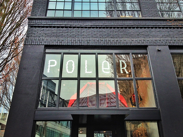
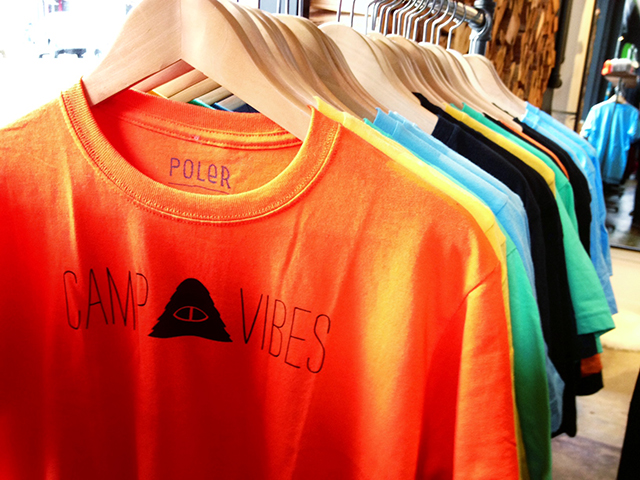
I was hoping to be the first in line. A camper, in an iconic bright orange Poler tent pitched outside the flagship store, which opened today at 10AM, just a few blocks from my studio in NW Portland. I wasn’t the first there, I was actually among many thronging fans of the brand, eager to get my grimy mits on some adventure-inspired hats, tees, and a combination backpack/camera bag. Forgive the photography in this post, it’s my first time posting with iPhone pics. After watching the first season of House of Cards, I wanted to play my hand at “mobile” blogging. Here we go.
In early summer 2011 I posted about Dunderdon, which happens to be the exact same location where Poler has opened their first shop on Earth. Same build-out, same brilliance designed by the magician Mr. Mathew Foster while he was co-creative director at OMFGCO, before he moved his practice to Los Angeles.
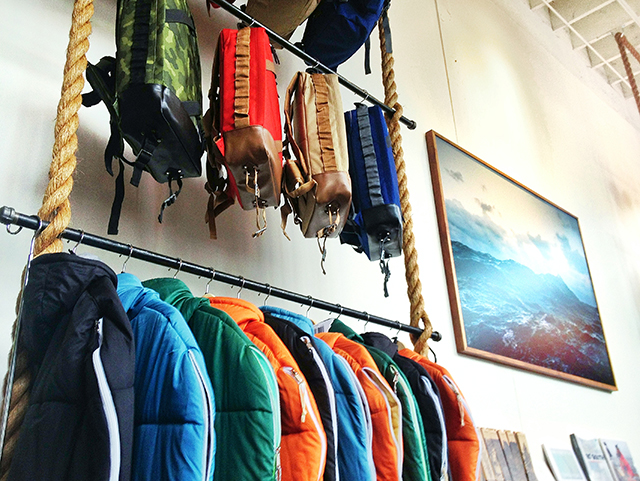
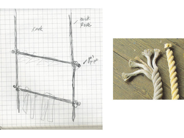
Mr. Foster was kind enough to share his initial sketches for the rope racks, which lift the eyes up to the vault-like ceilings. The floor-to-ceiling steel shelves are amazing structures on their own right, fabricated by Garth Klippert, of G. Steel Design Build.
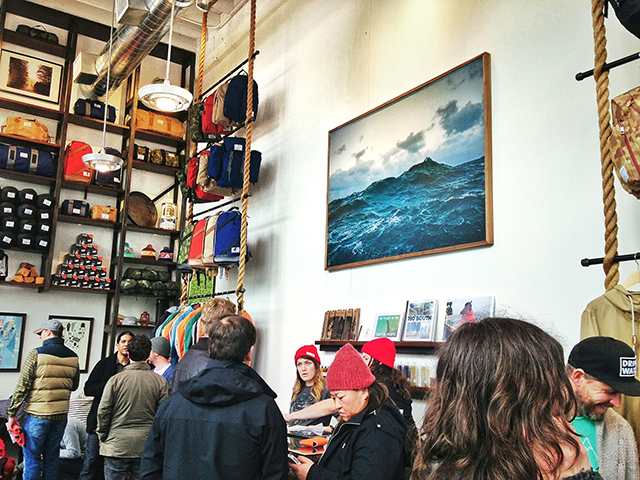
No one could go wrong with this team. In addition to Foster on design and Klippert on steel fabrication, Beam & Anchor also lent expertise to the furniture. Small and tall, you’ll feel like the space stretches out before you even though it is intimately compact. Just the right size to inspire, and designed by a crack team of smart locals.
I’ve commented previously on the way Poler speaks to its audience, and praised the brand for its voice, point of view, and ability to make humans frothy over the idea of getting outside. I also want to express the excitement and timeliness of this flagship idea, in an important retail corner of North West Portland.
Previously, the space was occupied by Dunderdon, with neighbors Blackbird and Tanner Goods. Dunderdon opened in Spring 2011, with that same stunning Corey Arnold oceanic wonder-print behind the cash wrap.
It’s still an interesting corner of downtown. Shared by space station-like Solestruck Shoes, it appears that retail here is either hyper-local, or nothing at all. Appropriate, for being a stones throw from Powell’s Books, and crowd of densely clustered culturally historic establishments.
Actually seeing the merchandise wash nigh impossible today due to crowds, but today wasn’t about browsing, it was about feeling like a camper in gear heaven. The price is right, the tone is chill, the owners are stalwart Oregon beard growers, and it all feels like Portland major league. That heavy moss/rain aftertaste that makes this place so delicious. With my haul, it’s only a few hours before I break in some of this gear in the Gorge tomorrow morning. I’ll use it with love and get it dirty with pride. Yeah I’m drinking the koolaid, but this is my hometown and goddamn I’m proud of these guys. This was only confirmed when they reposted one of my Instagram snaps, which made me immediately scream and barf, simultaneously.
If you have a phone and like pictures (that’s everybody, right?) follow Poler on Instagram.
If you are not in PoPo land get online and marvel at their adventures in photography, and if you’re feeling spry pick up a little something for the kids.
Design Week Registration Opens!

It’s happening.
Tuesday (tomorrow, Sept. 18) is the official day you can register for Design Week Portland. And you really should register! October 9 is coming sooner than you think.
So, now that you’re planning on registering tomorrow, get excited. Ryan Bush and I (together you may address us as TAIGA) have put together a little teaser featuring Steve Sandstrom from a Designspeaks event earlier this year (Here is the direct link in case your browser doesn’t load it below).
There is more where this came from, in fact there is a Designspeaks event with Jeff Kovel of Skylab on October 11 and the folks behind Designspeaks are launching a new series called The Straight Six on Saturday night at Instrument. So sharpen your pencils, and buy fresh notebooks Portland. Get ready to get positively sizzled.
Steve Sandstrom, Designspeaks teaser from TAIGA on Vimeo.
Of course there is a full interview behind this preview. After you all register (I mean all of you) we’ll let it loose. Stay tuned!
Building OZ
Inside Oz from Ryan Bush on Vimeo.
+++++++++++++++++++++++++++++++++++++++++++++
This was an incredible project.
It’s rare, I think, when we get to work on projects we love from brief to delivery. We must consider ourselves lucky when a client gives us full creative control, and is as professionally supportive as the Ozgener family, whom I’d like to introduce you to.
This family came to the United States from Turkey. They raised a family here, did good business, and now have reached a point in their lives when they’d like to do passion-based work. To this family, this means opening a contemporary art gallery and event space in their hometown, Nashville.
There are varying degrees of cultural and story-based richness to draw on when looking at this sort of project. First in branding, and second, in the extension of identity. How can one communicate deep story, authentic branding, and expression of service in a single mark? How can you encourage viewers to lean-in and become fans of the brand over long-term, meaningful interaction?
“OZ” was chosen deliberately. First, it’s a portion of the family name. But more importantly, it’s an idea. Cano Ozgener, the family patriarch, expresses that The Wizard of Oz is his favorite film, and he understands the cultural nuances of the Emerald City and its wizard. When I first heard over the phone the new company’s name, my mind started to spin. Those two letters, one completely curvilinear, the other it’s opposite, were going to be fun to play with.
And so I played. And listened. “You must go to the mountain now” Mr. Ozgener told me in his living room in early 2012.
Happily.
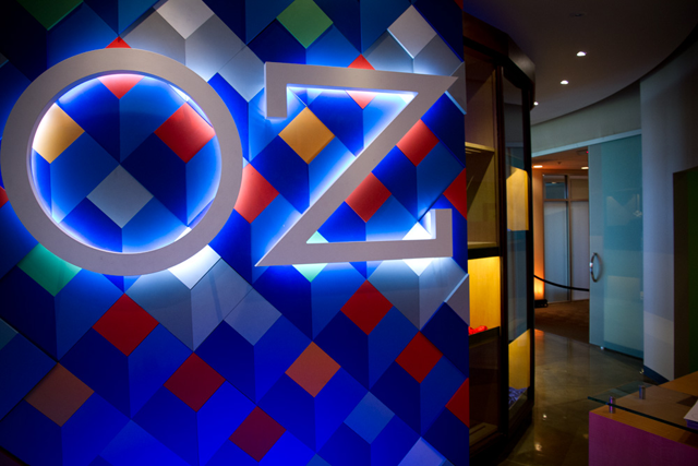
The part of the brief that is covered in the short film (top of post) is a design installation that lives in the entry way to OZ Nashville. The family requested a permanent design, based on everything I’d learned in the discovery phase. I decided to make a custom mosaic, utilizing cultural cues from Iznik (famous Turkish pottery and motifs), and extruded typography in a dramatic setting.
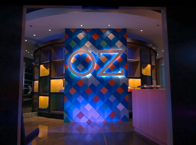
The building phase began. I realized I needed help, and so I used Instagram to it’s greatest utility – to bring people together. I put out a plea for helping hands, and was humbled and shocked to have an immediate, butt-saving response. Ryan Bush, Allison Berg, and Alex Taylor stayed till 4 am one night, and got up early the next morning and returned for more. In the midst of their portfolio reviews at PSU. Amazing.
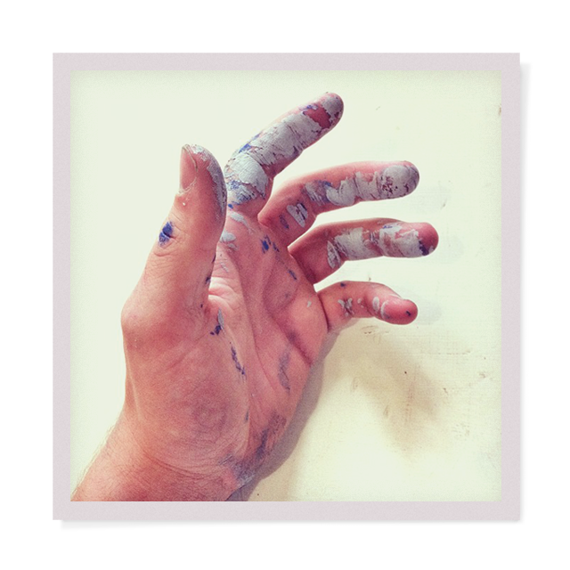

Ryan J Bush, Alex R Taylor, Allison Berg, Mirtho Prepont, Nishat Akhtar, Mathew Foster
Will Bryant, Alisha Henson, Ethan Furniss, Janice Grube, Kate Bingaman-Burt
Seamus Holley, Jon James Staton
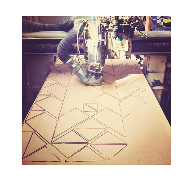
Once done with the mosaic, I separated each item by size and ganged them up onto 4 x 8′ documents, which was then cut out of 1/2″ medium density fiber board (MDF). This material is incredibly heavy, and after 8 sheets were fully utilized, the scale of this piece began to reveal itself. Nothing like creating something you are somewhat frightened of. Only the expertise of Seamus Holley could handle this sort of request, I am incredibly grateful for his knowledge.
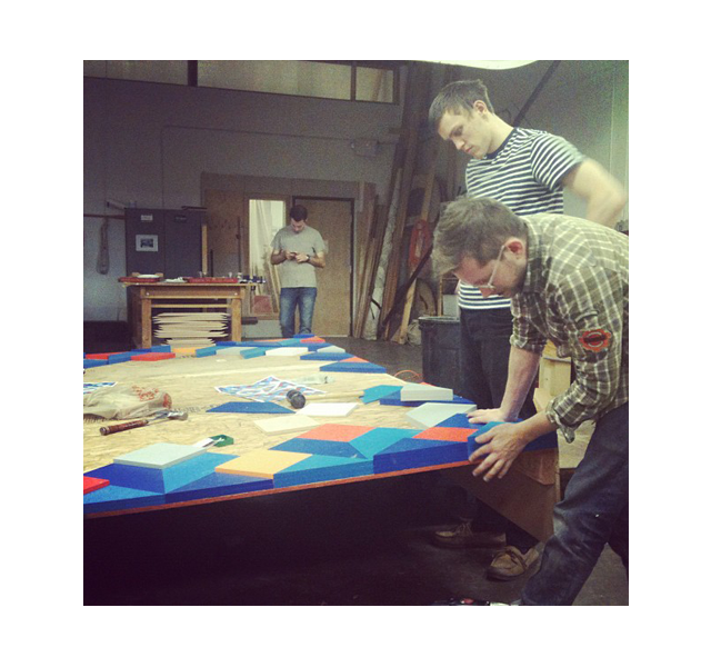
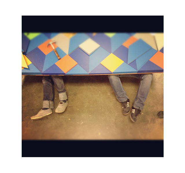
Hundreds of pieces were hand sanded, primed, and painted with 3 coats of matte paint, which took an incredible chunk of time. But the challenge then was attaching them in a permanent fashion from behind, one by one. We’d work in groups of 4, two under, and two above, guiding the tackers with LED lights shone through pilot holes. Untold hours, untold gratitude for my helpers. Did I mention they were not getting paid? Oh right there’s that. I owe you one guys.
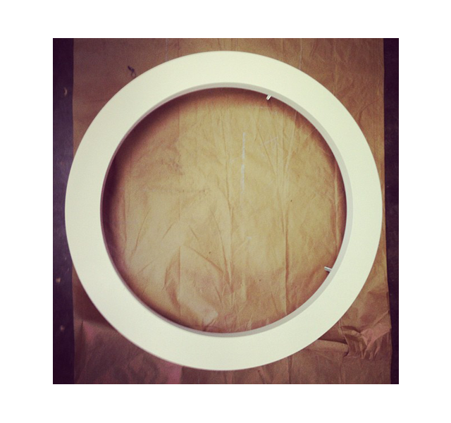
Letters were cut from the same material by CNC. Layered, counter-sunk by carriage bolts for a seamless finish from the front. Behind the letters we placed strips of true-white LED lights that would separate the letters from the mosaic.
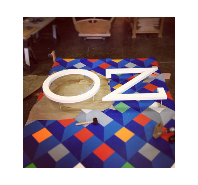
We then drilled directly through the mosaic pieces for the 8 carriage bolts. A harrowing experience. 1/4″ error in any direction would have killed the entire piece. We “kerned” these letters, looked, re-kerned, looked again from across the room, adjusted here, nudged there. Fretting very much. A few words of encouragement from Kate Bingaman-Burt, I held my breath and drilled into the mosaic. Safe.
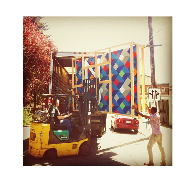
Then the scariest moment of my adult life. The forklift.
I’d like to never repeat this moment. The protective skeleton cracked and bent when the forks went under it. And then the entire 650 lb. oblong piece swayed in the wind for a moment of terror as it was lifted from the street. It stabilized, and somehow (I don’t know how, I blacked out) these stalwart men guided it gently onto the bed of the truck. That was awful.
The piece arrived, damaged, and 3 days late. We fixed it. Worked it. Stressed out, re-painted, installed it and secured it in a matter of hours. More help arrived, at one point we had a proper crew of 6 professionals making it happen. Right up until 20 minutes before the opening reception.
Ryan Bush and I raced back to our hotel, ironed our shirts, changed into suits, and rushed back
just in time.
Growth, I’m finding, often comes from nauseatingly stressful situations.
I’m so grateful to have been a part of this one.
Citius, altius, fortius.
Interview with designer Jordan Metcalf
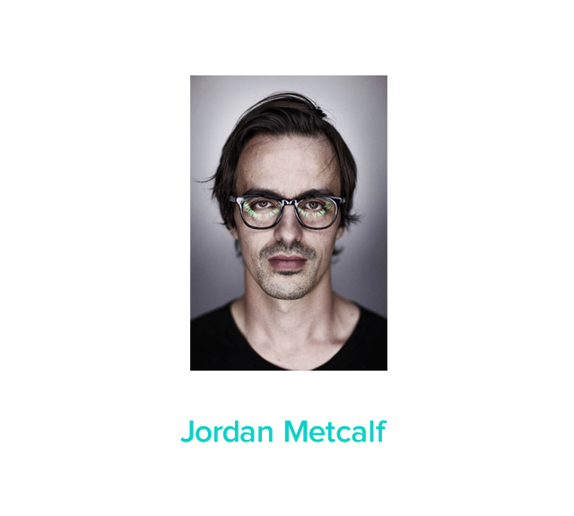
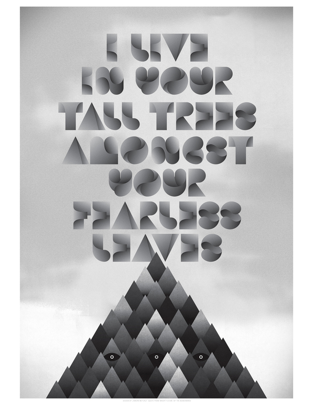
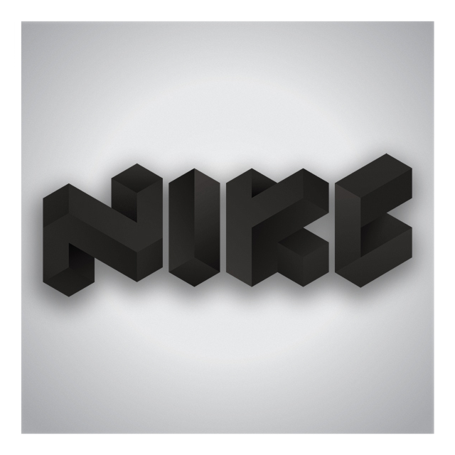
Cape Town, South Africa. Jordan Metcalf gets a fanboy email from FORTPORT and is generous enough to answer a few questions from a stranger in Oregon. What an awesome morning it was to read his responses for breakfast. Who could predict Mr. Metcalf had such rich, true, and insightful comments in addition to his broad body of work and talent. Design without borders, insight worth sharing. A brief interview with typographer, designer, illustrator, and artist Jordan Metcalf. Portrait by Morné van Zyl.
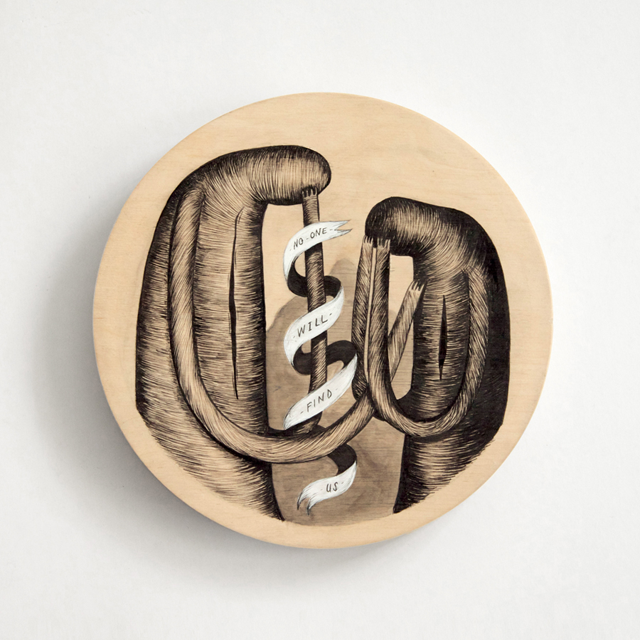
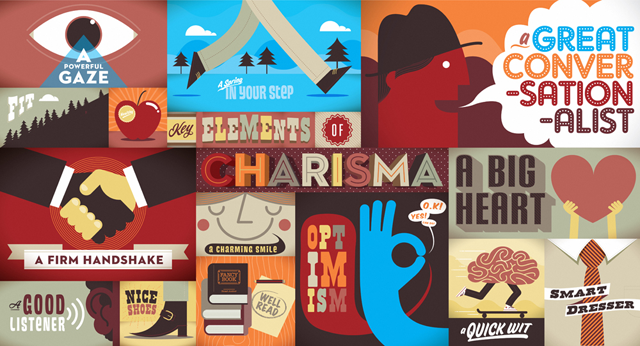

FP: You’re an illustrator and designer, as well as a collaborator. Ever get asked to define yourself as one of these, and not all of them simultaneously?
JM: Sometimes when being asked for a job title for an interview or legal form. Mostly I say graphic designer, as it’s the easiest and probably most accurate. I don’t get too existential about it though, I just try to make work I enjoy; for me it all falls into the same thing.
FP: Your manner of executing expressive type is stunning. Where do you go to be stunned?
JM: I feel like, as creatives, we’ve gotten ourselves into a frenzy of image consumption in pursuit of what is mistakenly labeled as ‘inspiration’. I have amazing respect and appreciation for loads of artists and designers but I think the things I’m most stunned by are outside of the the world of graphic design. I’m usually most blown away by scientific and technological discoveries and breakthroughs. I’m humbled by the amazing things we’re capable of making and achieving, and how the more we understand, the more we discover still needs to be learnt.
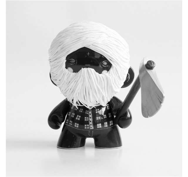

FP: Prompt: Working as a designer in South Africa.
JM: South Africa is this amazing and complex place. A dichotomy of rich and poor, with a stark and ever-present contrast between the privileged and the disenfranchised, and a meeting of diverse cultures that in some parts merge and others clash. It is a beautiful place, full of mountains and beaches and deserts and amazing creative people, beset by historical, but very much pervasive social inequities. So while being a designer is in many ways probably very similar to how it is anywhere else, I think this undercurrent of real socio-economic problems and political dissatisfaction lend a weight and depth to much of the design produced here. While it’s not always something I am able to visually discuss in commercial work, it definitely informs the way I think, work and act.

FP: Despite being busy, you still did an interview with a complete stranger (me). How important is relationship in the work you do?
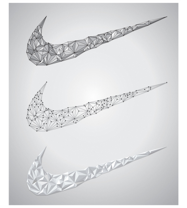
JM: Hugely. In a broad sense I think we’re privileged to live at a time where such connections are possible. The internet has really opened up the world, made it possible to form real and substantial connections based on mutual admiration and shared interest, not just geographical proximity. In a smaller, more personal sense, relationships and connections are concepts that run through most of my personal work. I think human connection is something we’re all looking for.


FP: Complete: Dear recent design graduates…
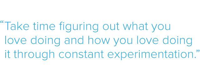
JM: Take time figuring out what you love doing and how you love doing it through constant experimentation. Don’t let the internet be your first and last stop for inspiration; mostly it just offers easy out’s. In the long run you’ll be much happier trying and (sometimes) failing with your own ideas than reproducing other people’s success’.

