Vignelli gets on it
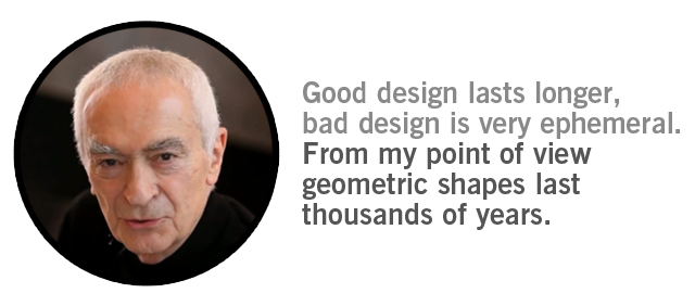
This spot is like sitting down in a comfy $15,000 leather Vignelli couch. You may want to stretch out on it, and you will most certainly be left wanting more of it in your life. Obviously well-timed for the opening of the Vignelli Center for Design Studies at RIT, the spot (below) is full to the brim of quotable quips from the modern master, which is expected from a man with as many years of experience in any field. He has mentioned a few things though that I thought were particularly interesting.
You have to train yourself to have vision, courage and determination. These three things to me are very important. You have to work with people who have this and at the same time you have to have it so you can instill it in people.
You should not have a fear of failure, this is what marketing is all about, fear of failure. Instead you have to have courage. Courage not to fail, courage even to fail.
Also, his commentary on the state of design education I found of particular interest.
The quality of education that there is now was not available 50 years ago. Today from a certain point of view the United States has even taken leadership in design. There are thousands, really thousands of students of design coming out in the market every year. When I was young, very few, as a matter of fact.

Watching Massimo update his iconic 1972 design of the Manhattan subway system for the iPad was pretty much the highlight of my week. He is not allowed to pass away, this living treasure of modernism still contributes to our field in such a magnanimous way that I can’t quite imagine design without him around. I find it so interesting when designers work their whole lives and then keep going long after the age of retirement. There has got to be some study out there with the percentage, it must be very high.
Regarding his remarks on design education, it is a phenomenon. Still, the mainstream (err, everyone in my life at least) doesn’t know what a designer does. When I tell someone my field they always ask “so you make, like, brochures, right?” However, just at Portland State University alone there are 500+ design majors being pumped out into this relatively small town every year. Is there going to be a saturation point? Or just a curve where only the exceptionally determined get jobs. If you ask me that sounds cut-throat.
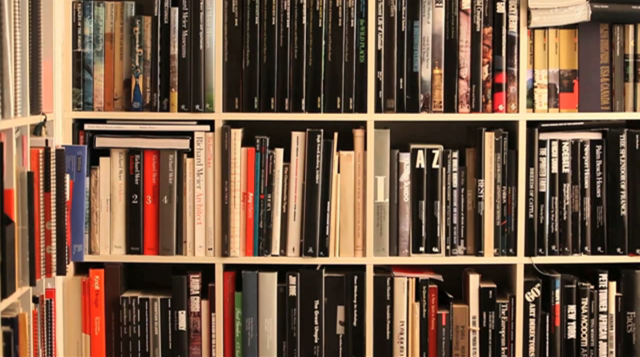
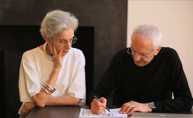
What I wouldn’t give to stand in front of Vignelli’s personal library. It’s probably one of the best libraries in the United States, in regards to design, and probably everything that influences it, which, is everything. He seems so calm and methodical about his approach. Like the way he sits down and draws a room with a pencil in perfect perspective. Excuse me, but what a bad ass. Can I buy you a bourbon, sir? Portland will embrace you if you ever come this way, I promise. Then, perhaps you could update our janky Tri-Met program to something useful, and hopefully, not vulgar.
Perspective narrative
Perspective, or more importantly narrative. We each have several, perhaps hundreds. On the front door of my identity there are a few narratives: male, curious, young, European-descendant, son of a logger. What does it mean though for my personal narratives if I can successfully mesh with narratives around me? Or, perhaps, narratives that will never come in contact with my own (ie. the narrative of a Siberian Mystic living in obscurity)?
One of the many gifts of this first decade of this millennium is that we can access foreign perspectives without leaving our homes in a variety of ways. Obviously, books have been the main route to this kind of mental self-expansion, but now we have tools that bring the Earth and other perspectives into our ears, eyes, and collective consciousness.
I recall when I first began realizing how magnanimous this idea is when the famous Japanese astronaut @Astro_Soichi began tweeting his pics from space to his fellow ground-based friends (all 300,000 of them). He would snap a picture each day from out the spacecraft window and send aerial photos of cities that he would then send a shout-out to. A friend of mine commented “when that dude flies over Portland and tweets us from space I think I’m going to explode.” In that moment, we would have both the perspective of life on the ground, and ourselves from space, simultaneously. You know, like when you look in the mirror with another mirror in your hand at that pimple on the back of your neck.
In the context of narrative, ours are probably bigger than any of our ancestors. We have huge narratives. It’s worth bragging about!
So if twitter allows us to hold two mirrors to ourselves, what is it when we begin to mesh perspectives and narratives? Just more damn enlightenment, or something useful? Well before we answer take a look at a dual sunrise/sunset, filmed at the same time, but on different sides of our home planet. When the sun sets in Miami Beach, it rises in Southern China. Why this only has 80 views is beyond me.
Let’s explore more. The other day I found a little site called Globe Genie developed by someone at MIT (presumably jmcmicha? feel free to snoop his directory) and it got me thinking about this subject. The tool allows users to click on a continent, or choose all seven and then transports you via Google Earth street view to a random but specific location. We all know about Google Earth but this subtle variation disallows us to choose our destination, and relies instead of an algorithm that will drop you pretty much anywhere on Earth. Suddenly, you are on a street in the outskirts of Rio, or on a rocky beach in midsummer in Antarctica. Here are a few places I was dropped instantly, each on a different continent:
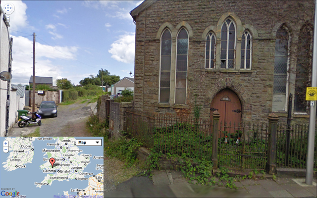
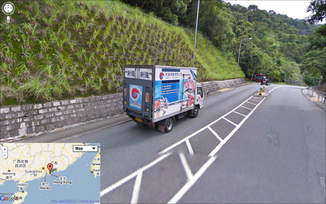
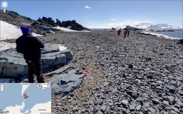
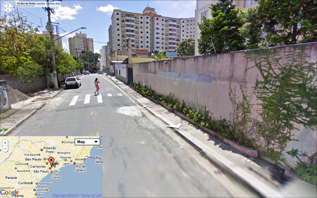
I find it so fascinating that this tool (or trick, is it as cheap as a trick?) not only takes me to a place but it’s so obviously a moment in time, especially apparent when a human is in the picture. I can then imagine what that moment was like and almost share it with the human in the photo. In fact I am sharing the moment with the human in the photo. I can imagine their perspective, checking out the odd Google car with a creepy all-seeing camera mounted on the hood. Perhaps they knew what it was, perhaps they forgot about it moments after it passed. But I’ve not forgotten about it. A couple years after the photo was taken (I’m guessing) here I am bringing this moment back to life at this incredibly specific place and wondering how it’s impacting my life to have access to this information.
I promise I won’t get meta, but come on this is thrilling! Now, we all have our own tools that get us excited for similar reasons, perhaps yours is Vimeo, or reading blogs (have you heard of that fort something-or-other?), or human-to-human interaction. Whatever it is, we’re expanding. In the context of narrative, ours are probably bigger than any of our ancestors. We have huge narratives. It’s worth bragging about!
If this doesn’t influence my work, then I’m not doing it right. I want to expand my contexts, narratives, and perspectives as violently (figuratively speaking) as possible. We’re talking weekly, collecting new ones, if possible. Man, this place is sparkly.
OK, here are 3 (hopefully fresh for you) quick perspective narratives. Holy Islamic, Military Industrial North Korean, and early morning Vancouver, Canada neighborhood. Combine, stir gently, and consume. It’s delicious, I promise. The awesome thing is, these 3 things (and millions more) are all happening simultaneously. Where are you in all this?
Stan Rogers
Stan Rogers wasn’t born in the Maritimes but it’s fair to say that they claim him. Early in his life he spent summers and formative years in Nova Scotia which greatly influenced his musical career and point of view on the world, singing epic love songs to the life, myth, and grandeur of a life at sea. The influence of the maritime tradition is held by many Canadians, regardless of their proximity to the sea, which can be seen on the Canadian dime. On it, rests the Queen of the Grand banks, the mythical Bluenose Schooner, which can also be seen on the license plates of Nova Scotia, and on old 50 cent stamps.

![Canadian_Dime_thumb[5]](http://www.fortport.com/wp-content/uploads/2010/10/Canadian_Dime_thumb5.jpg)
Sadly, Mr. Rogers didn’t make it out of an airplane that caught fire to save his life in 1983. His career, though truncated, was magnanimous enough to start a legend, and today his albums, distinctive voice, and influence on folk music still hold strong as the image of the Bluenose. In fact, one of my favorite songs he wrote is about this very ship, simply titled “Bluenose” with incredibly written poetry around the idea of a national icon.
Feel her bow rise free of Mother Sea
In a sunburst cloud of spray
That stings the cheek while the rigging will speak
Of sea-miles gone awaySo does she not take wing like a living thing
Child of the moving tide
See her pass with grace on the water’s face
With clean and quiet pride
Here, rare footage of the original Bluenose schooner, racing against her Gloucester rival, the Gertrude L. Thibault, is set to Stan Roger’s inspiring music and voice:
Here, Stan is seen in-action with his maritime countrymen long ago in what appears to be a sleepy fishing village filled to the brim with tall tales. He wrote a song called Barrett’s Privateers chronicling the angst of a contract fisherman and his broken dreams at sea, reflecting on his life on a Halifax pier. What I would give to be in this room with a lager tapping my toes with these men. Their appearance is incredible!
It saddens me to think about his early death, and that today he’d be a crusty old man like Willy Nelson, the northern version. Still, I don’t really tire of his music. Though I’m not a sailor or Canadian, it does seem to somehow fit with the regional heritage of the Pacific Northwest, especially when he sings about the Northwest Passage, following the Fraser river to the sea, etc. It’s a wild sounding music. Underproduced, true to its source, and a fresh sound for eager ears. Each song just sounds like it was recorded one evening at a friends house over booze, a good meal, and a cozy fire. I’ll take that life.
Food Issue, shot by Lucas Foglia
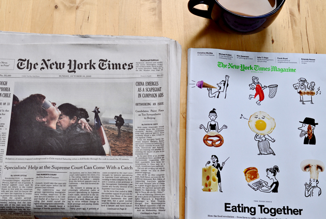
Sunday means The New York Times is all over my house. Ripped apart, crinkled, piled up, sat on, spilled on, and loved, very well loved. Each year the NYT Magazine does a few food issues, this one with a great article by Michael Pollan on a 36-hour dinner party cooked in a cob oven consisting of one goat, one fire, and many cooks. Do not read if you are hungry, you will want to eat the magazine. Obviously there is great content throughout, especially if you are a foodie or a closet locavore. But turn to page 70 and prep your eyes for the sweet, sweet photographs of Lucas Foglia. The title of the piece is Food Groups. The direction, sets, props, facial expressions, poses, attire, titles, typography, and perspective are wonderful. Lucas, thank you. You are a talented human, and you just made me hungry for a farmers market meal.
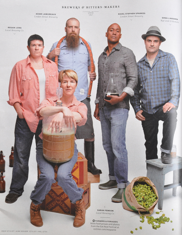
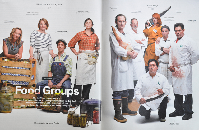
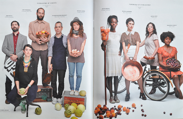
I want to know all of these people, why are they not in my life? What I’m realizing though, is that when you get a group of humans together looking the way they normally look, the effect can be just as powerful as humans that have been primped and coiffed. Just look at these guys, either they want to feed me a mean meal or eff me up. Probably both, I can deal with that. I can’t tear my eyes away. Naturally, I went straight to the interwebs to find more of Mr. Foglia’s work. I found epic journeys where he travels around the US photographing off-the-grid communities and places like the largest tract of undeveloped land in the contiguous United States.

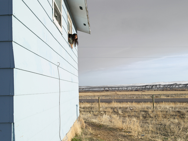
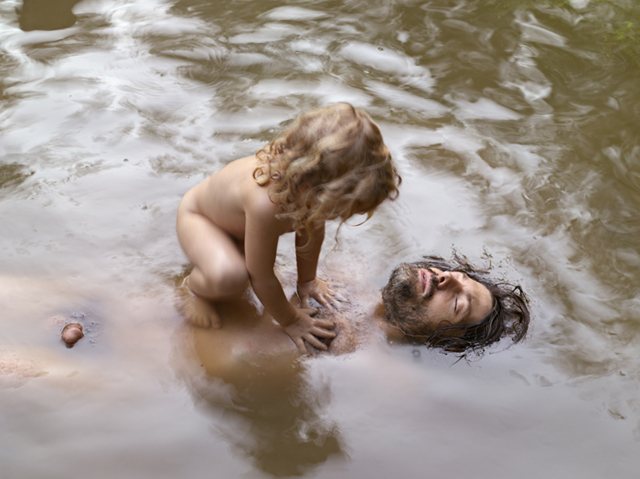

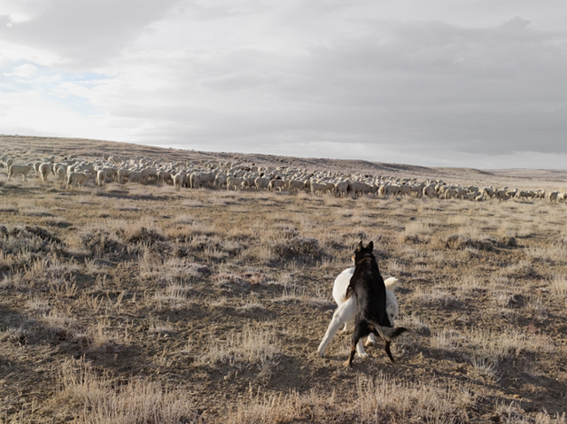
Alright, I need to tell you the title of this last photograph is called Guarding the Sheep, and it basically makes my day. Also I can safely say that is the first full frontal male image on the FORT so I suppose we should celebrate? Regardless of milestones and reproductive organs, I find it interesting that Lucas’ work for the NYT Magazine is completely different than the work on his portfolio site. Hallelujah. It can be disappointing to look someone up and only find work that is all the same, shot in the same perspective, with similar lighting. It’s just so inspiring to see depth of skill in a given field. I tip my hat.
Color.

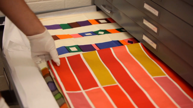
Well these two little videos will just make you want to give Kate Bingaman-Burt a sloppy wet kiss and or a bear hug. Especially when in the first video some serious textile drawers are opened. Aaron Britt at Dwell Magazine is knee-deep in a series on color called Full Spectrum which is being shot by Gary Nadeau. One part of this awesome little series takes place at the Albers foundation in Connecticut, where lovely anecdotes can be viewed in regards to the late master of color. Quite a few people already know of the series, but in case you’d not heard or seen pieces of it, I highly recommend it for your mental health. Even if you aren’t into design, color theory, or the fullness life can offer you. Watch these, they are wonderful. And the music is done by Wonderful!
Susan Lyons over at Herman Miller had some great insight on color & the practice of “choosing” colors for things that are designed to be functional, not trendy.
“I think the issue of context is really, really important. Because the object never is sitting alone in a room, it’s always residing with other things.”
“The Eames’ talked about this idea of ‘the way it should-be-ness’ as a quality, that you would make things and keep making things and keep iterating until you knew you had it the way it should be. It wasn’t a sort of prescriptiveness, design is an iterative process where you are constantly exploring and you don’t really want to know what the end result is. It’s about exploration.”

“Alexander Girard felt it was important to have color around you, to have pattern around you, because it was nourishing. And people absolutely loved it.”
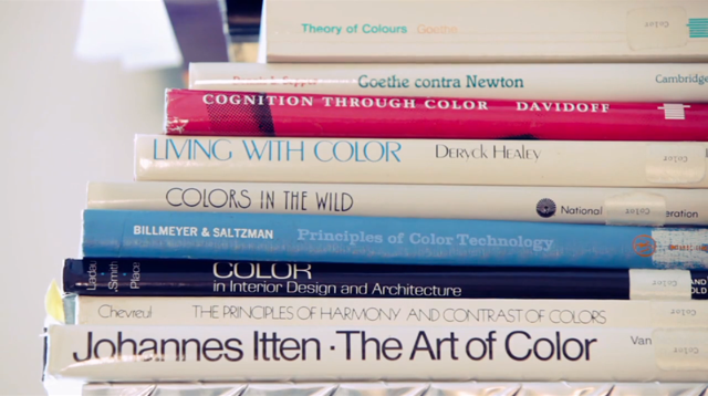
I recall during the first year of design school studying the work of Johannes Itten from his landmark book The Elements of Color (which is actually a condensed selection of The Art of Color, seen above). Specifically, Itten took students and readers through a series of exercises executed in checkerboard pattern swatches based on various color harmonies. At the time I remember reviewing these and thinking that there was really nothing special about these checkerboxes and that honestly matching colors was just a matter of using the eyedropper tool. Luckily I kept my book (as all students should, at least if they are in the design department) and flipping through it today I find myself continually shocked at the excellence displayed there. When done correctly, a checkerboard can just knock you off your rocker! How is it possible that these colors can be so relevant, modern, subtle, and jolting at the same instant?

The second video in this series takes place in Soho at an off-the-rack clothier called Seize sur Vingt and its CEO James Jurney. Within the context of clothing and expressing yourself through what you choose to put on your body, James explains how his shop came to be in the 90’s when everyone was wearing kakhi’s and blue dress shirts. It’s great how this short spot basically explains the purpose of the neutral suit, and how to paint within the confines of, say, the grey workers suit.

