Philippe Jaroussky sounds like an angel
 is name is probably the easiest to misspell in the Western world, but you will be rewarded for remembering it. Philippe Jaroussky is a French countertenor that has been the object of much attention for a peculiar talent he possesses. He can sing like a woman. Well, in fact, he can sing how the Angel Gabriel probably sang at the age of 10. Do angels age? Anyway, Mr. Jaroussky has been on the top of my list for a few years when I need to hear the human voice, and I was so pleased to find a huge feature on him in the New York Times Magazine!
The particular talent of being a fully grown man but being able to still sound like a choir boy is called castrati. There is a reason castrati sounds like castrated, because in antiquity these talents were robbed of their special parts in order to preserve the ability to sing at such high octaves. Often the castrati would go on to enjoy lucrative careers of public adoration. Sadly, not all who were castrated though made it and were left by the wayside, ignored and humiliated. Luckily, we don’t do this any longer, we wait for it to happen naturally. Enter Philippe.
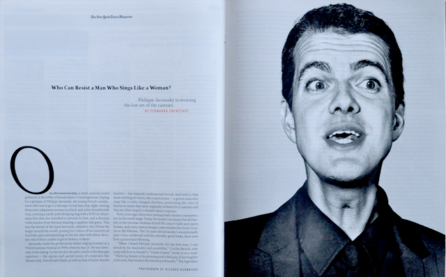
I’m not sure if this photograph by Richard Burbridge is the most flattering of the man, but it does emphasize the point that he is famous for what resides in his larynx. If you heard Philippe sing on-record rather than in video form you might have the same reaction as when you first heard the BeeGees. Impossibly female, as in, that cannot be a man singing. Not everyone loves the idea of a man being able to sing at such high tones, it’s definitely something one gets used to over a period of time. When Philippe first met Fernanda Eberstadt he acknowledged “It’s true that there is something potentially ridiculous about this voice coming out of a man’s body.”
If one can stomach it, it’s worth holding your nose and going for it. There isn’t any risk involved other than seeing something, perhaps, odd, and hearing something that should not be coming from a man. In retrospect, however, we find that Shakespearean comedy and pre-19th-century opera were both based on the premise that what makes a woman go crazy is a boyish man who might or might not be a girl. Interesting set up for the following clip:
This is from the album Vivaldi: Nisi Dominus & Stabat Mater, the first song Philippe sings in the clip is Cum Dederit which by the way stops people in their tracks. I listened to it when I was in Yosemite this summer and my head almost imploded. Beauty upon beauty. Sometimes it’s just too much, you know? Anyhow, it’s an excellent album completely through, from the first track to the 19th one. The Amen is also so incredible, you’ll see it at about 2:53 in the clip above. Surprising, flowing, eloquently baroque. Excellent holiday gift for yourself or someone you think deserves something that sounds like liquid platinum in your ears.
The books in the Fort
I was asked recently what I was reading, but not in the sense of “currently.” I think I was being asked what books I turn to when I need to. I’ve got a few standards, a few golden pages that continually intrigue, pay off, and illicit. I don’t exactly read these, but I study them. Design reading is a different category, and probably a boring one. I’ll also mention that it just started snowing outside, the first of the year on the valley floor here in the Pacific Northwest. Great time for a post!
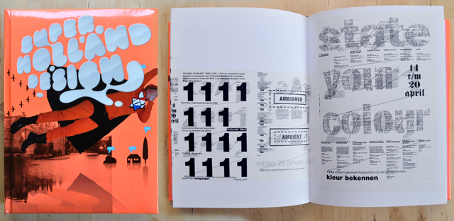
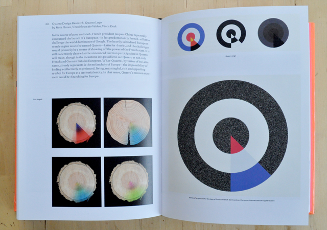
Super Holland Design is a follow up to Holland Design, first published in 2001, and explores contemporary Dutch design & art direction. The incredible thing about this book is that it is bursting with ideas, rather than treatments. It is an art director’s dream, a jolting step into the world of visual communication. Each time I crack its puffy neon spine I find a new source/thought/idea and it absolutely thrills me.
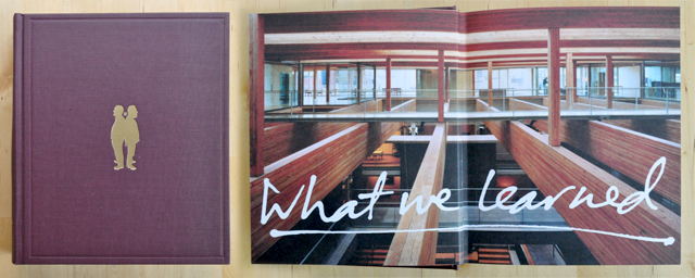
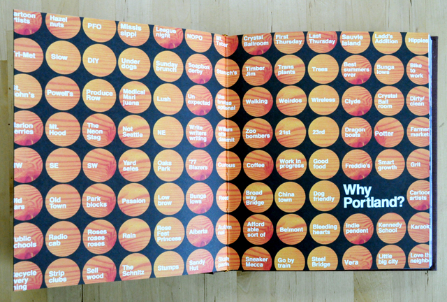
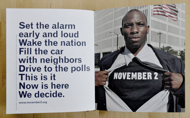
The next one was done here in Portland. It is the first book from the first year of W+K 12 entitled What We Learned. The front cover holds a gold foil stamp of Dan and David standing back-to-back, and one of the first spreads is a photograph of the upper floor of Wieden + Kennedy with type scribbled across it. The book contains all of the work done in the first year of 12, and what a year it was.
I love the Why Portland spread, and all of its answers. Timber Jim! That particular one has special interest to me now, as well as DIY, Old Town, Little Big City, and Walking. Ok the whole spread is incredible. The November 2 work also is incredible, if you want to see the TV spot that accompanied it, watch it here, directed by Jelly Helm.
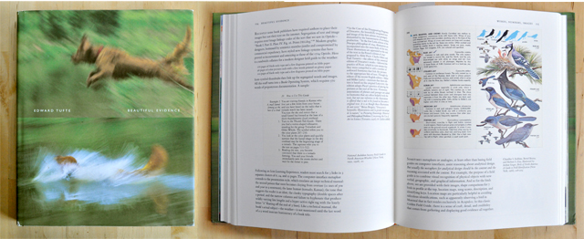
A. How could I not include Tufte and B. how could I not include a Tufte spread with birds? Well ok, this is standard, I realize, often assigned to students studying information design, but that cover! It’s one of the books that when set out people can’t resist to pick up. Who would put a blurry photograph on the cover of a book? Who would put two?
Tufte is so required that I never put him back on the shelf. Any of his works will do, I chose to show Beautiful Evidence and was happy to find it later assigned in more than one class I’ve taken. I do recommend just purchasing the bundle along with Envisioning Information and the Visual Display of Quantitative Information if you know what’s good for your grey matter.
In particular within these pages you will find the most exhaustive and brilliant break down of what is probably the most famous information graphic in the world. Tufte hands you Charles Joseph Minard’s data map that represents French losses during the invasion of Russia in 1812. In such a way that no one else could, he explains the implications of every line on that map, and allows the reader to take away the skills needed to convey data-rich visualizations. Invaluable resource.

Many people know of this book, it’s fairly common. Fingerprint is not just a DIY book on how to make crafty junk. It has real solutions that designers can integrate and manipulate for any sort of project. Beyond awesome how-to’s it’s just a good starting point for generating ideas and ways to approach upcoming work. Plus, I actually did stain my cover and no one will ever notice (mid-left at spine)!

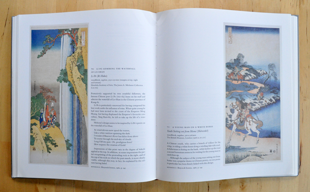
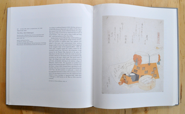
Japan’s most famous artist can be traced back to one of Japan’s most famous images, the nice thing about this book is that it’s barely mentioned. Spanning his entire career, Hokusai: Prints and Drawings is exhaustive, informative, and incredible. Also a little perverse, with some scandalous prints depicting naughty things, in oh such a refined manner. This was actually my first book of art, I’ve had it for so long I don’t recall how it came into my life. Perhaps as the best present ever? Perhaps I found it as a child stumbling through the halls of Powell’s. I have no idea where my dust cover is either, but I recall it wasn’t that great anyway.
I used to try and recreate some of his waterfall prints with acrylic paints on canvas. An absolute disaster, I learned how to mimic, interpret, and also get frustrated with my inabilities. On composition, balance, and pattern, this book is pure poetry. I remember realizing that I first had an emotional response to art within the pages of this book. Complete treasure.
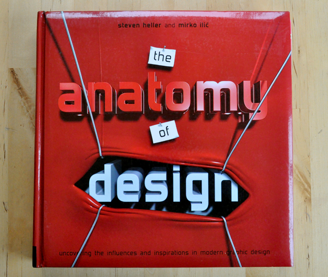
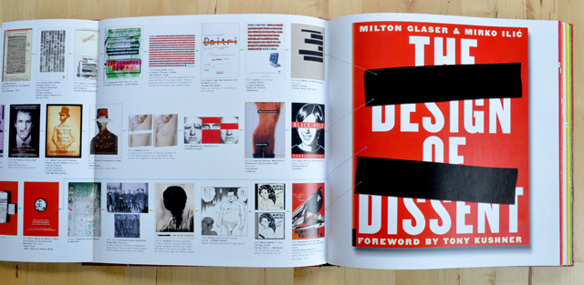
Another puffy book! It may be squishy to the touch but open it up and revel in the sheer amount of design history. Alright so each page in this book is a fold-out. On the far right is a contemporary design piece, and the fold out shows its complete graphic history. Basically how we got to the point of the contemporary piece. Some of the precedents go back thousands of years, many to the early 1900’s. It is such an excellent concept for a book, I cannot imagine the amount of research this required.
The Anatomy of Design isn’t something I pull off the shelf too often, but when I’m looking to begin thinking how to approach a problem it is a great way to see what has come before me. The combination of what has been done along with my own cloud reading and dream sequences seem to be a nice spark for something newish.
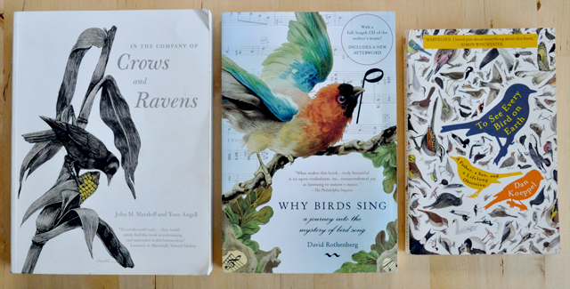
How could I not?
I’ve a shelf for this subject, and these 3 above have many friends. If Hokusai can paint One Hundred Views of Mount Fuji, I can have bird books coming out my ears and write in my Birders Journal. We all need a few obsessions.
Strategy Can Do Better, Mr. Haque
Umair Haque recently published an article for the Harvard Business Review that I’ve read now four times and it’s time to talk about it. The piece is called Strategy Can Do Better and quantifies what so many people have been feeling so deeply but couldn’t quite get out of their mouths. The piece is so brilliant, so verbally satisfying that I couldn’t regurgitate my own version and provide any improvement whatsoever, so I’m going to quote him, alot. It’s just worth preserving and spreading.
Mr. Haque’s main points revolve around depth, purpose, community, value, people, and beauty, in the world of goods, services, or anything that humans can purchase. We’ve talked about it before, but never in a manner that explicitly calls out the parameters of doing “good” work today. A best practices manual, if you will.
He uses Pontiac as his contextual reference point, and then breaks apart why Pontiac failed.
Purpose.
“You’ve got to make the case for why what you’re making creates value that matters, counts, endures, last, and multiplies — instead of just the illusion of value.”
Yes, ok, making the case for yourself. This would be marketing yourself, but the second half of the sentence is where most corporations & marketers have to take a seat. Value that matters. And multiplies. Wait, matters to whom? Value matters to shareholders, it’s value! So it’s safe to assume value is defined not as currency, but something more meaty. Probably something a human can actually be enriched from. Awesome start, ok show me the rest.
Community
“Walking into a Pontiac dealer was about as “exciting” as watching paint dry in a prison cell. It probably should have been a pulpit of higher purpose, a place from which Pontiac could have invited people to join the flock, and shared with them why Pontiac mattered in bigger, larger, more vital terms than mere “excitement” in the first place — and perhaps even encouraged them to contribute to that larger cause.”
So, clearly, Pontiac just wanted to sell cars and not sell to humans.
People
“people are vital contributors to the art of creating an enduring advantage — and that when people are just dehumanized corporobots, mattering in human terms ceases to be possible.”
Which is why we are where we are at this stage. As stated, it’s why airline attendants won’t take your garbage anymore, why the cubicle belongs in a history book, and why companies like Pontiac fail, and fail hard. Realizing that people are the potent elixir behind any successful brand or experience is so seemingly obvious that it’s been missed altogether.
Beauty
“A steadfast, holistic, uncompromising commitment to beauty, instead of lowest-common-denominator design-by-committee? That’s probably what creating a razor sharp advantage in an arid world of bland, insipid — and sometimes just plain unsightly and unlovable — commodities piling up by the supertankerful is going to take.”
I love that beauty is the last on the list. Generally beauty is enough. It’s not anymore. Designers are trained to make something beautiful, but why are they not trained to make something meaningful? It’s where this century is going, it’s a clear and as fine as the needle in a compass. And here I find myself still making pretty things that are just absolute shite in terms of actual value. This is not abundance, this is not prosperity.
And on prosperity:
“Maybe relying on some enduring ideals is what will ignite a more authentic prosperity. And maybe yet more combat, conquest, plunder, and domination (yawn) won’t — and can’t.”
Still, in the business department today, in a liberal city, in a public university, students are taught how to undermine, cut, and consume their competition until the niche is theirs, and then to dominate it for absolutely as long as possible. Grow, expand, splice. Until there is nothing left to grow, expand, or splice. More plunder. Vikings, wearing Zegna suits and deck shoes on the weekend.
Enter the main star of the show, the wrap that couldn’t get any better.
When you read between the lines, companies that can do the above don’t just create McJobs, they create fulfilling work; they don’t just churn out more toxic junk to be mutely crammed down the throats of “consumers,” but meaningfully “good” goods; they don’t just earn a “profit” — they begin to create authentic, enduring value.
An economy of frenzied speculators flipping thin-value creating companies like Pontiac by the nanosecond, trying to desperately tapdance one step ahead of the next pyroclastic meltdown — that’s what we’ve got, and it’s a house of cards. So unless your definition of plenitude is McJobs, empty profits, excess capacity, mountains of debt, and general stagnation — well, without most of the above, I find hard to see how countries can meaningfully prosper.
Show stopper. This mans mouth speaks truth to power.
“How can you avoid joining the huddled masses of companies formerly known as the masters of the universe?
Don’t do more of. Do more than.”
Sunday Time(s)
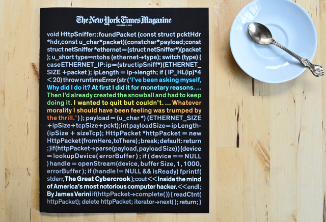
Sunday again. You know what this means in my house. This week, however, I was on a mission to find a friend of ours inside the newspaper, but a couple things first. The cover of the magazine is a simulacrum of the C++ code that exploits a common secutiry flaw in WiFi networks, allowing a hacker to impersonate a user on a particular web site. The code was adapted by Lacy Garrison who does some pretty incredible work for some serious clients.
When I first fished the magazine from the middle of my newspaper I started reading at the top and realized it was a snippet. I then read the type in color and understood the basis of the story before reading the synopsis. Awesome work, beautifully executed.
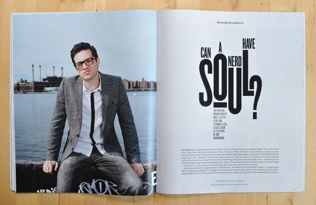
Additionally I was drawn to the editorial spread opener about soul musicians. At first though I felt that the graffiti on the wall Mayer Hawthorne is sitting on was distracting, but I don’t mind it now. I just with it was a thin tie he was wearing rather than a black stripe on his shirt. The typography here though is just incredible. I so adore the position of that question mark.
And then, I found what I was looking for! Lloyd Eugene Winter IV’s debut with the New York Times. What an awesome accomplishment dude!
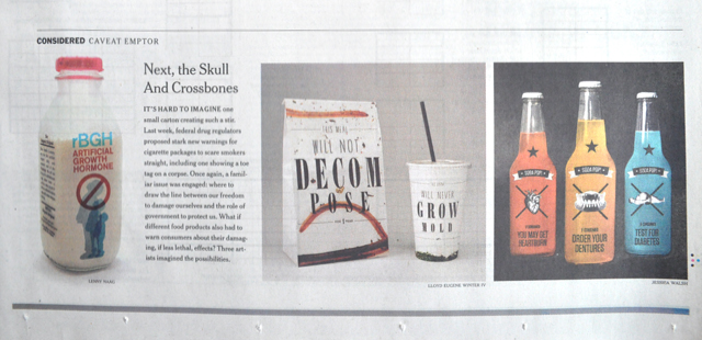
Lloyd’s work is in the middle and the spot represents three artist’s takes on the possibilites of warning labels on packaging. Lloyd’s shows the expected expiration of the contents and the packaging looks like it’s already on its way to being mulch. What’s also great is that I’ve not really seen Lloyd ever do work like this before. Expansion. Great work sir!
And, true to himself, he clearly requested NYT specifically credit him “IV”:

Public domain, white gold
Recently I was doing some digging and came across the largest public domain film archive I’ve ever imagined in my life. I was absolutely giddy when I realized that all the videos in the archive were simply a click away from being downloaded onto my machine, ready for the cutting board.
There are a few tricks to learning the keyword system, but once you get comfortable understanding how the archive stores information it’s basically an endless resource.
Here’s an alphabetical list by subject of just one of the major contributors to the archive. Outside of this contributor you can search by ‘moving images’ for video with basically any subject.
Interested in Eisenhower’s Presidential campaign spot from 1952?
Or perhaps a nice 35 minute spot from the Department of Defense and it’s documentation of the construction of the Alaskan Highway from 1944?
And let me tell you now there is 50-year old footage of Portland, Oregon in there too. I’ll let you dig for those. Just imagine an aerial shot of downtown portland circa 1960. Incredible.
Or, if you are so inclined, use some of your own footage. I did, take a look! Some things I’ve been cutting my hands on lately:

